Script / Lettering / Calligraphy
Script and lettering: calligraphy on the skin
A name in flowing cursive along the inside of a forearm. A single date in Roman numerals across the collarbone. A word in blackletter — thick, angular, medieval — spanning the width of the upper back. A Chicano script tattoo reading familia in elaborate, shadowed, flourished letters that took longer to execute than most portraits. A line of Arabic calligraphy running from right to left below the ribs. A typewriter-font quote on the inner bicep. The word “breathe” in someone’s own handwriting on the wrist.
Script and lettering tattoos are the most common category of tattooing worldwide. More people get words on their bodies than get any single image. A 2019 Ipsos survey found that among tattooed Americans, the most popular tattoo category was “a meaningful word, phrase, or quote.” The number is consistent with what tattoo artists report from their books: lettering, in some form, accounts for a substantial share of the work done in most commercial studios.
The category is broad enough to include some of the most technically demanding work in tattooing (Chicano calligraphy, formal blackletter) and some of the simplest (a four-letter word in a standard font).
Understanding the traditions behind lettering tattoos, what separates good lettering from bad, and how different letter styles behave on skin over time is useful for anyone considering words as a permanent part of their body.
The lettering traditions
Tattoo lettering draws from calligraphic, typographic, and handwriting traditions that were developed for paper and adapted to skin. The major families are distinct, and each has its own history, its own visual identity, and its own behaviour on the body.
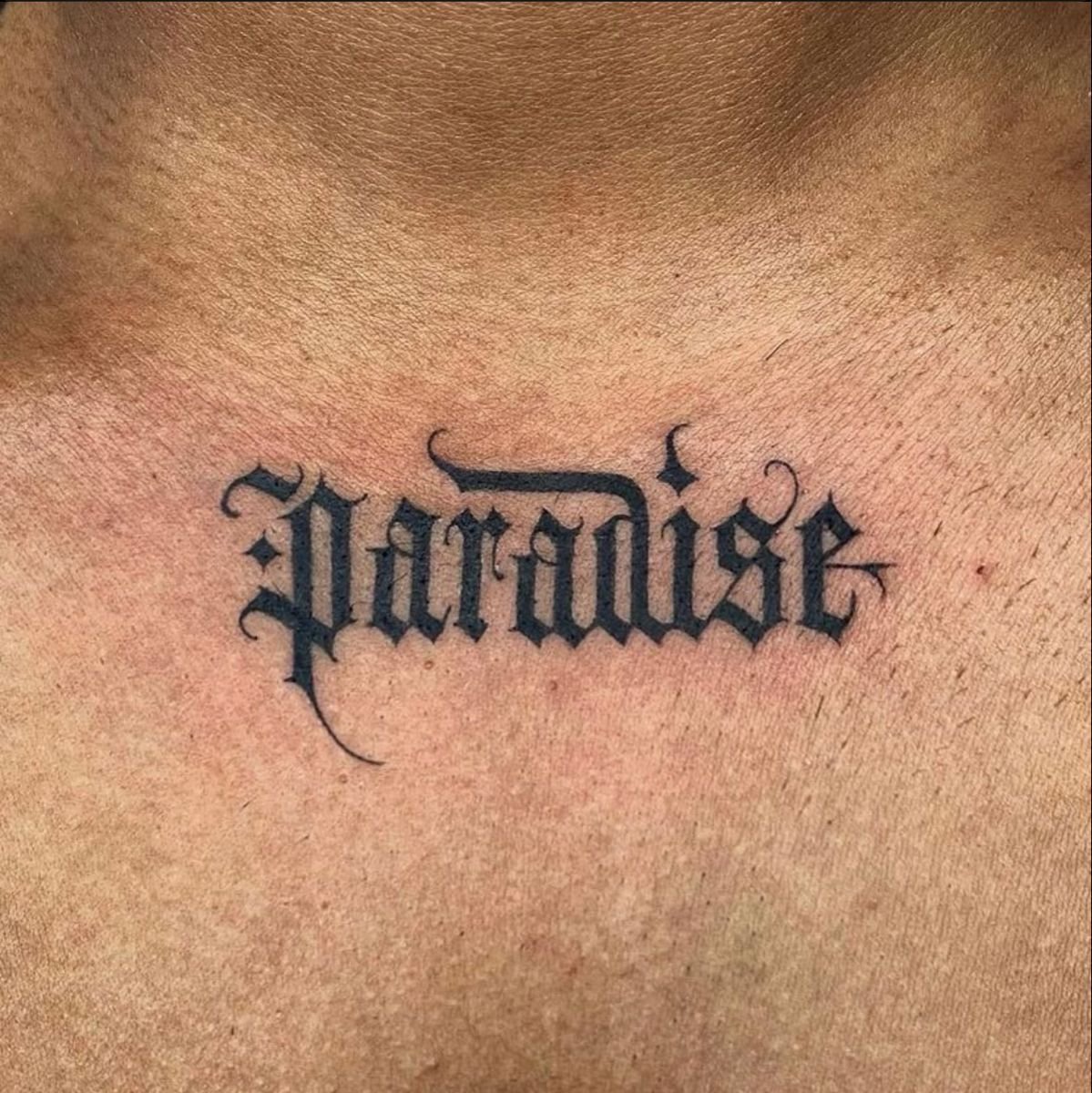
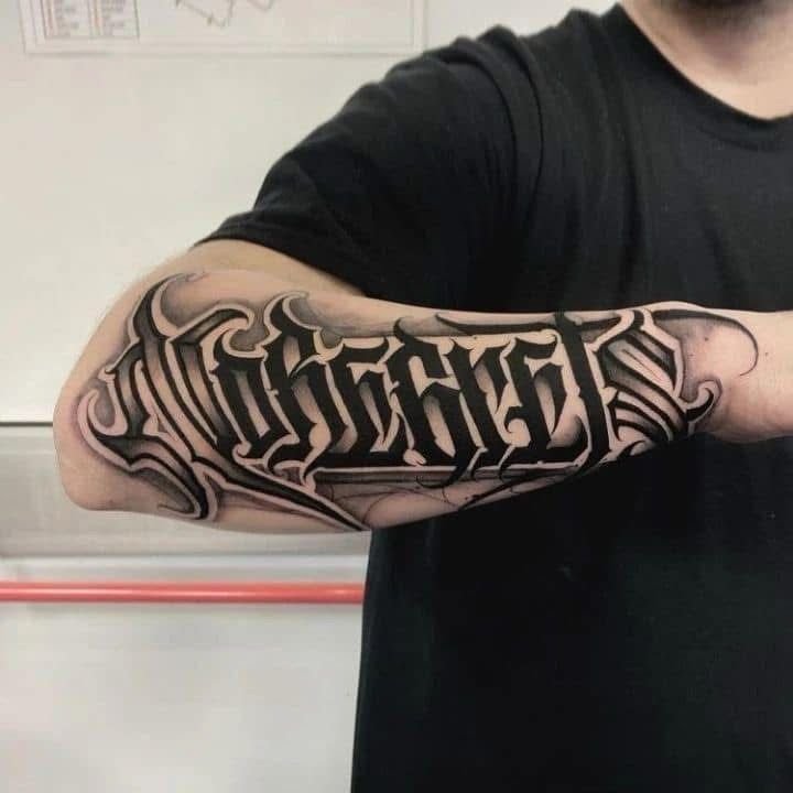
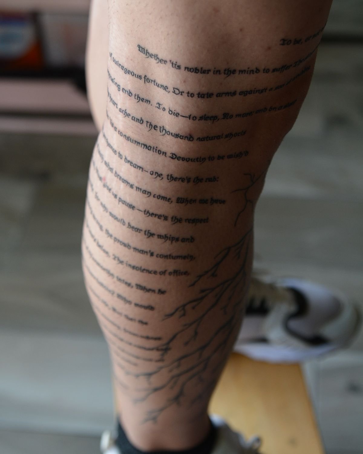
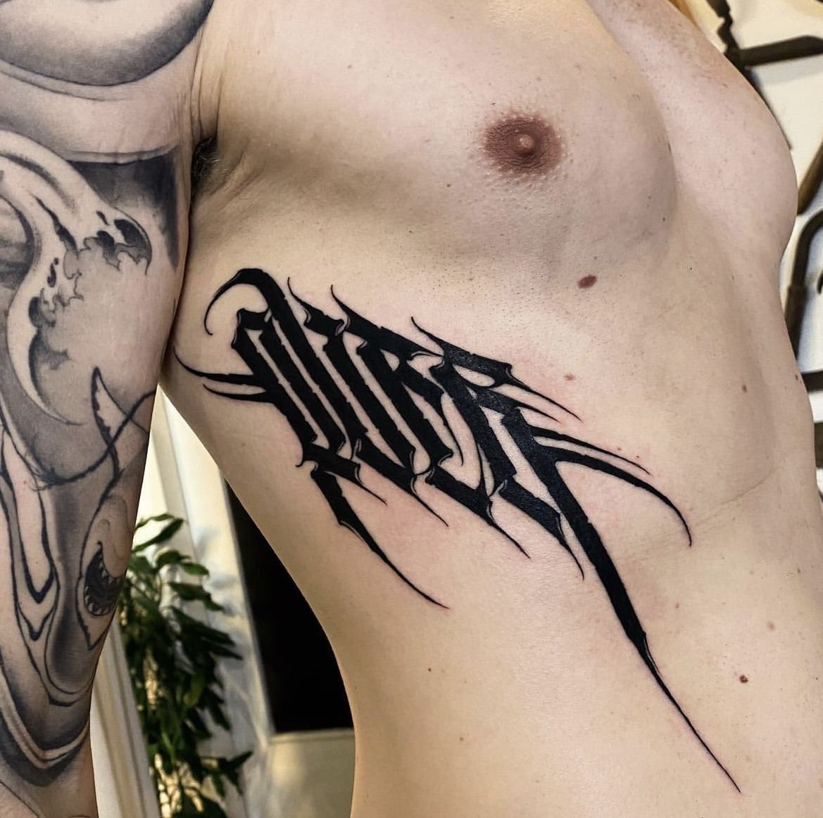
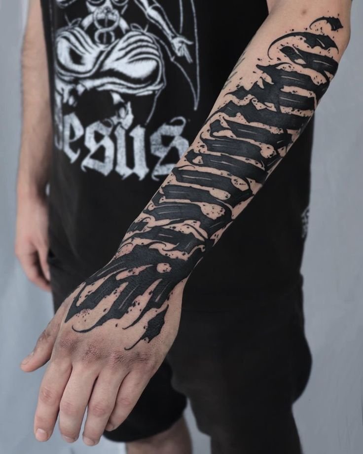
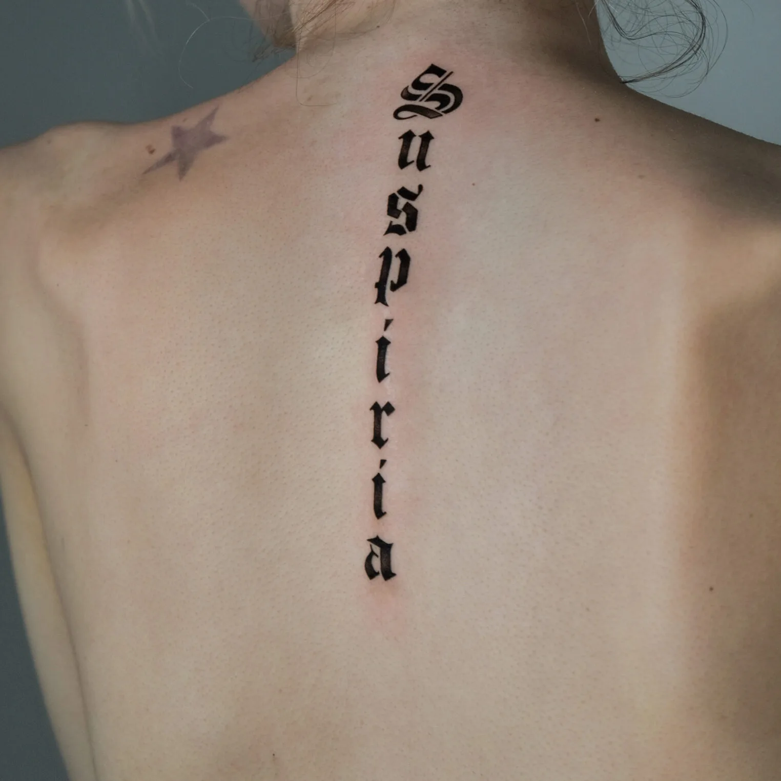
Blackletter (Gothic / Old English)
The angular, dense, vertically oriented letter style that most people call “Old English” is properly known as blackletter — a family of scripts that developed in medieval Europe from the twelfth century onward. The major historical blackletter variants are:
- textura (the most formal, used for liturgical manuscripts),
- rotunda (the southern European variant, slightly rounder),
- Schwabacher (a German everyday script),
- Fraktur (the most elaborate variant, used in German-speaking countries into the twentieth century).
Blackletter entered tattooing through two channels. The first was the general availability of blackletter as a display type — it has been used for headlines, shop signs, diplomas, and beer labels for centuries, and its visual association with tradition, authority, and seriousness made it a natural choice for tattoo lettering. The second, and more important for contemporary tattooing, was the Chicano tradition, which adopted Old English blackletter as one of its primary lettering styles.
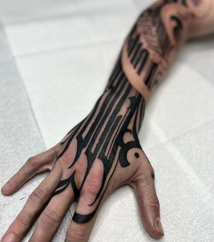
In tattoo contexts, blackletter is most commonly used for single words or short names — Loyalty, Respect, Family, a surname, a place name. The letters are heavy, angular, and visually commanding. They sit well on the upper back, the chest, the forearms, and — in the Chicano tradition — across the abdomen. Blackletter at large scale is one of the most graphically powerful lettering options in tattooing.
The technical demands are specific. Each letter in blackletter is built from multiple strokes with specific thick-thin transitions, and the consistency of these transitions across an entire word is what distinguishes good blackletter from poor. The spacing between letters (kerning) is critical: too tight and the letters merge into a black mass; too loose and the word loses its visual rhythm. A blackletter word that reads as a unified composition — each letter distinct but contributing to a continuous visual flow — requires genuine lettering skill.

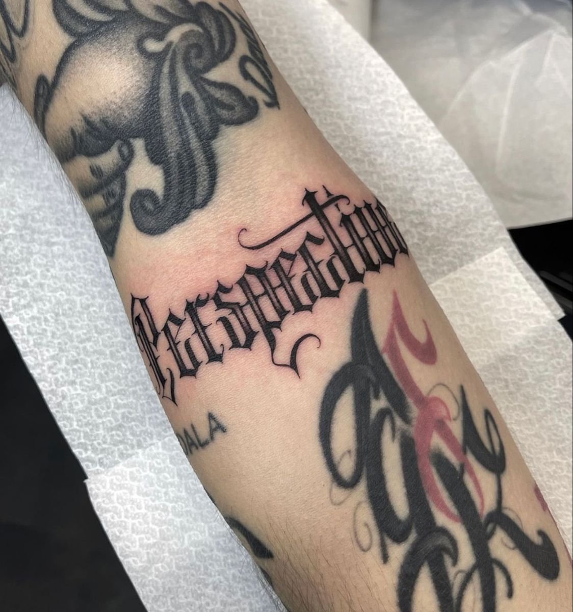
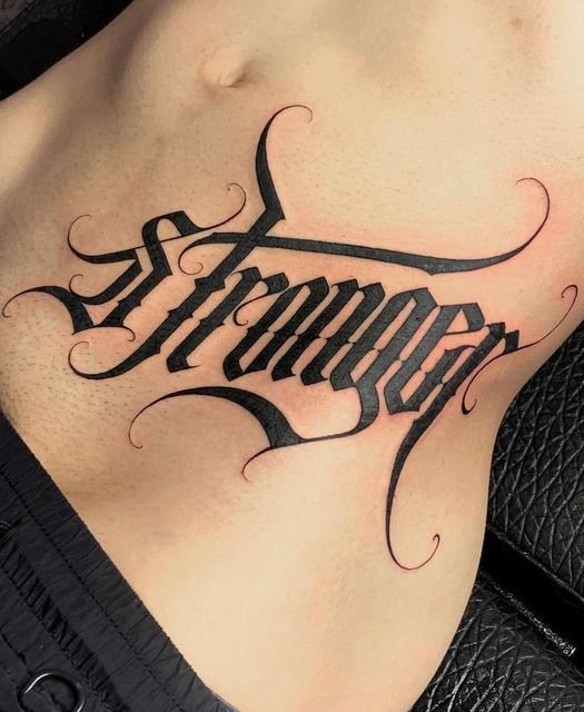
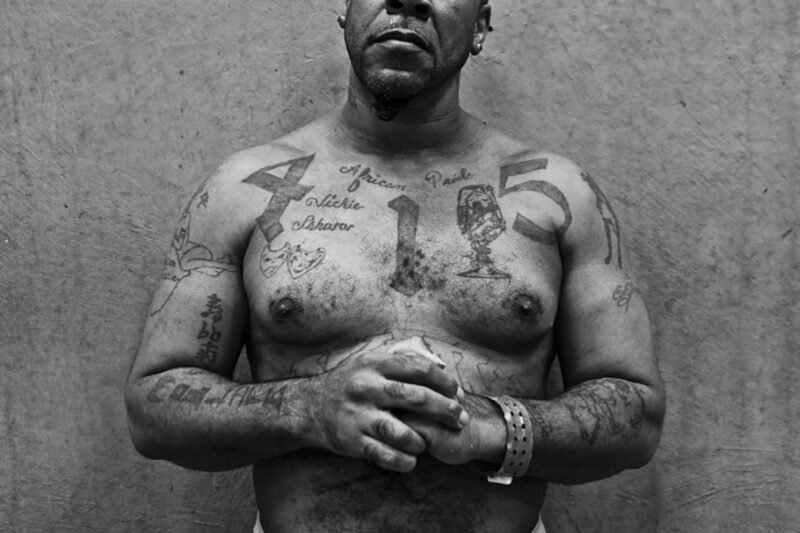
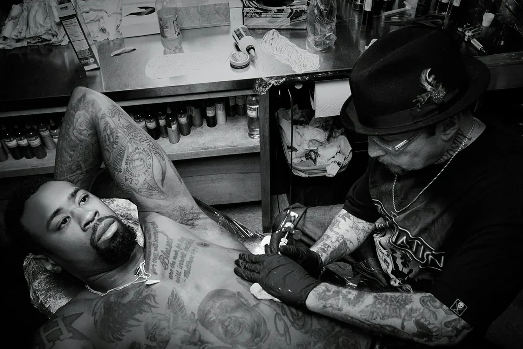
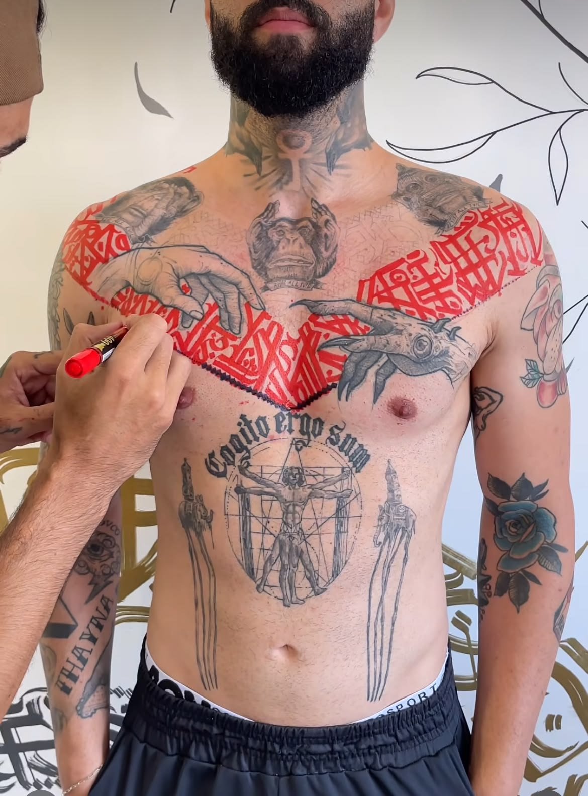
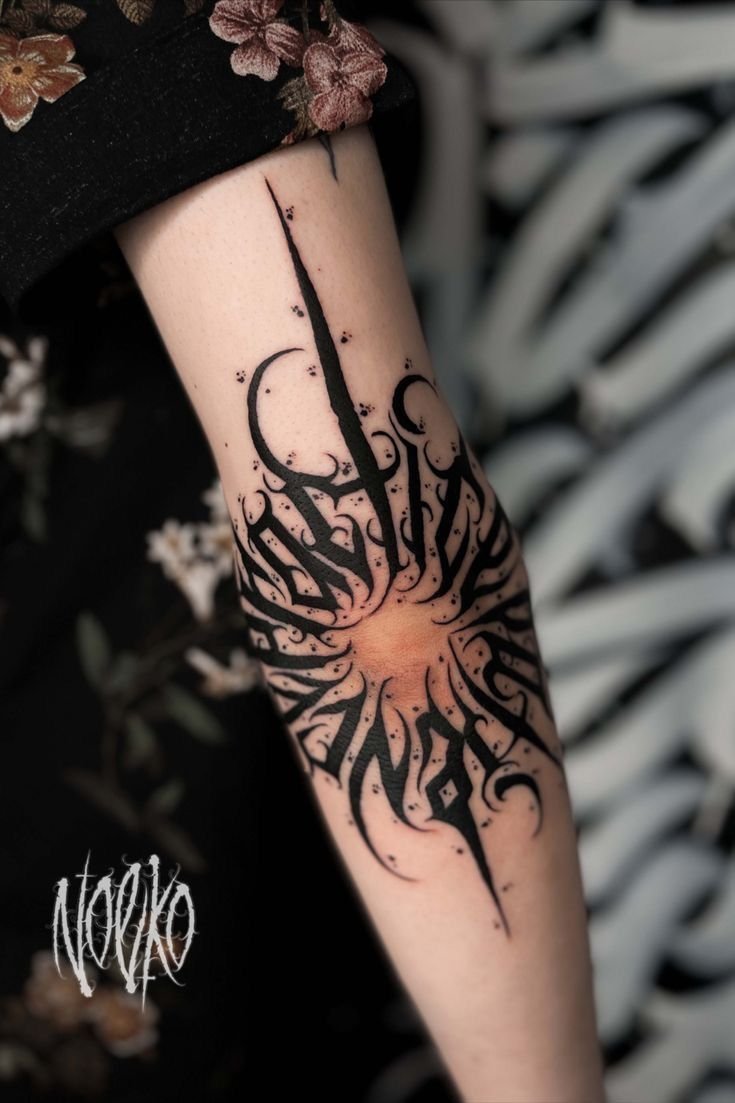
Chicano script
Chicano script is characterised by elaborate flourishes, extended strokes, ornate shading, and a specific combination of lightness and weight — thin hairline strokes swelling into thick downstrokes, with the transitions smooth and confident. The script is usually cursive (connected), with long ascenders and descenders (the strokes that extend above and below the main body of the letter), and the flourishes — the decorative curves that extend from the letterforms — are integral to the composition, not added afterthoughts.
The shading is a defining feature. Chicano script letters are frequently given three-dimensional weight through drop shadows, cast shadows, and gradient fills, making the letterforms appear to sit above the skin. The shadows are built in greywash — the same diluted-black technique used for Chicano portraiture — and the quality of the shadow work is one of the most visible markers of skill.
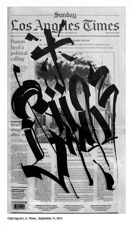
The tradition has its own masters and its own lineage. Chaz Bojórquez — the Los Angeles calligrapher whose cholo-style lettering has shaped Chicano visual culture more broadly — is the most cited figure. Big Sleeps (who publishes lettering guides through Big Sleeps Ink, including Sir Twice’s Chicano Style Lettering Guide) and Boog Star are among the contemporary practitioners who have documented and taught the tradition. The lettering is often the most important element in a Chicano tattoo composition — more prominent than the imagery it accompanies, and frequently the centrepiece of the piece.
The cultural context matters. Chicano script carries specific cultural meaning — it is identified with the Mexican-American community, with the barrio, with a particular visual tradition of pride, loyalty, and remembrance. The words most commonly rendered in Chicano script — family names, place names, memorial dates, phrases in Spanish and English expressing loyalty, love, respect, and faith — are chosen for their personal weight, and the elaborateness of the lettering is proportional to the seriousness of the content.
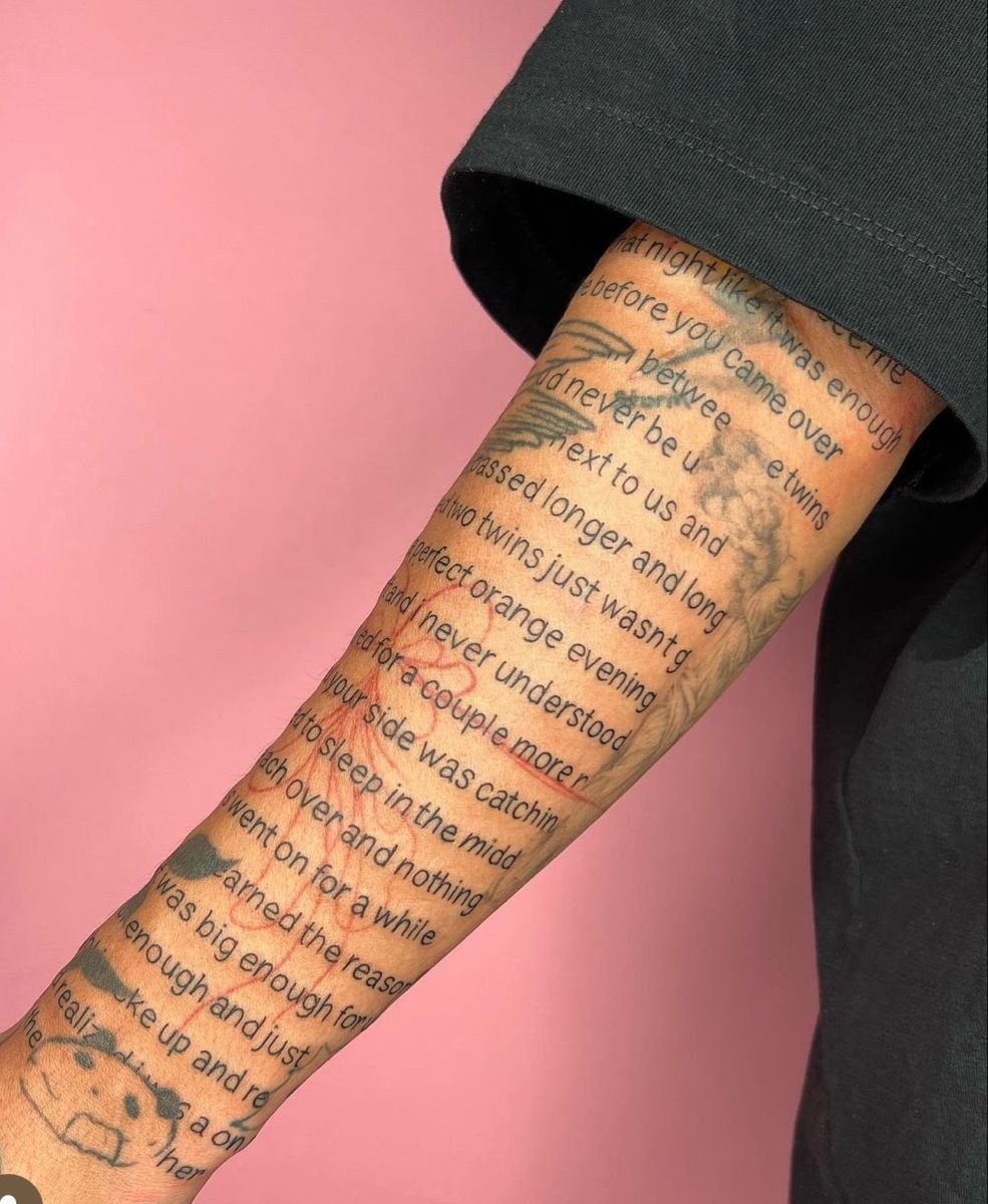
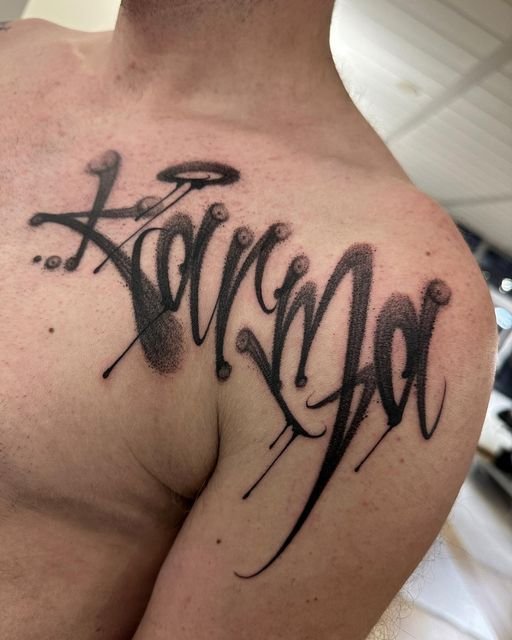
Cursive and script
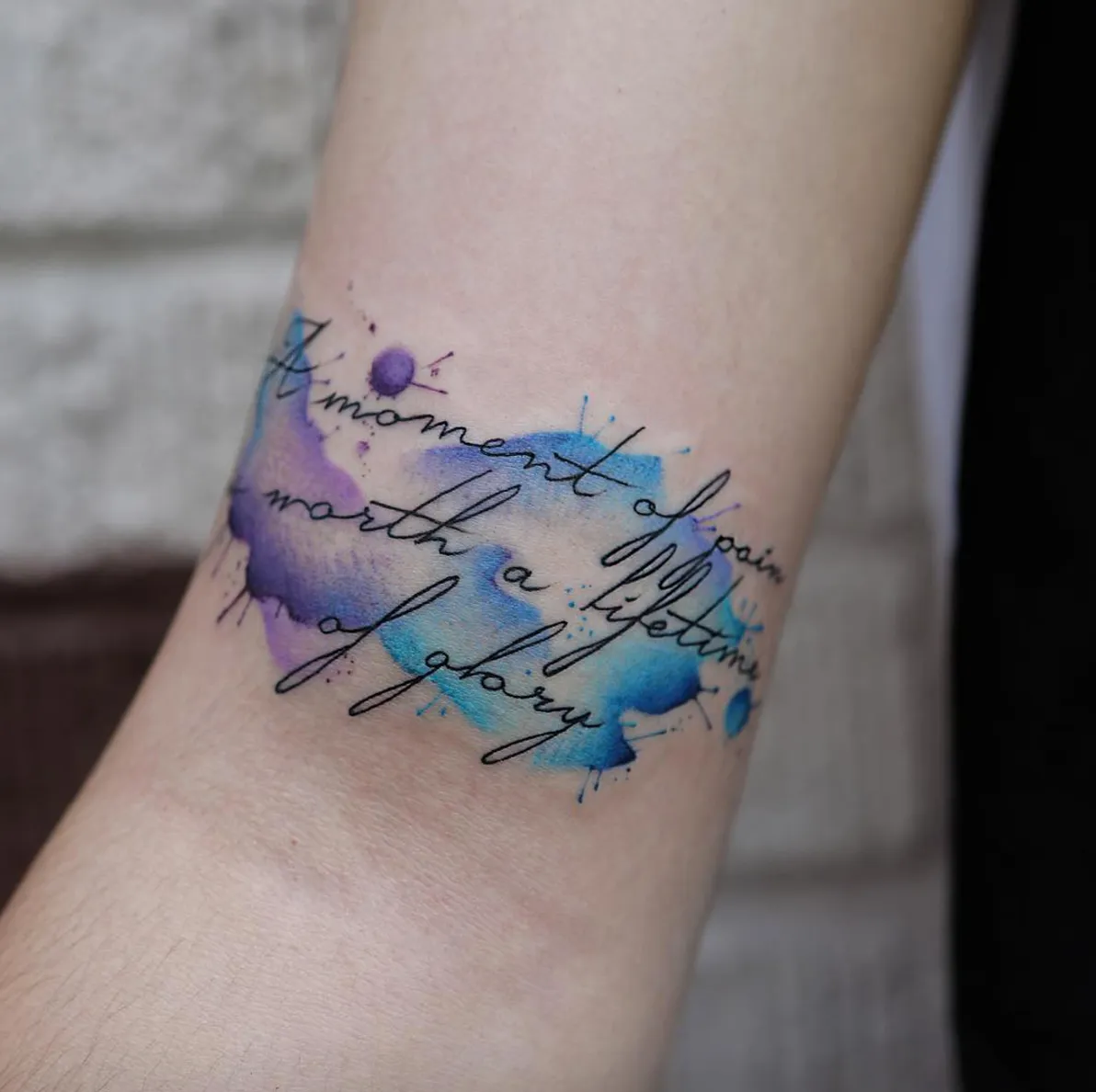
The broadest category. Cursive lettering — connected, flowing handwriting — is the most commonly requested lettering style in tattoo studios worldwide. The range within the category is enormous: from loose, casual handwriting styles to formal calligraphic scripts derived from Copperplate (English roundhand), Spencerian (the ornate American business script of the nineteenth century), and italic traditions.
Formal calligraphic scripts produce the most visually refined lettering tattoos. Copperplate — characterised by its thin upstrokes and thick downstrokes, its consistent angle, and its elegant oval letter forms — translates well to skin and is often used for names, dates, and short phrases. Spencerian — more ornate, with more flourishing and more variation in stroke weight — is technically demanding but produces lettering of extraordinary visual richness.
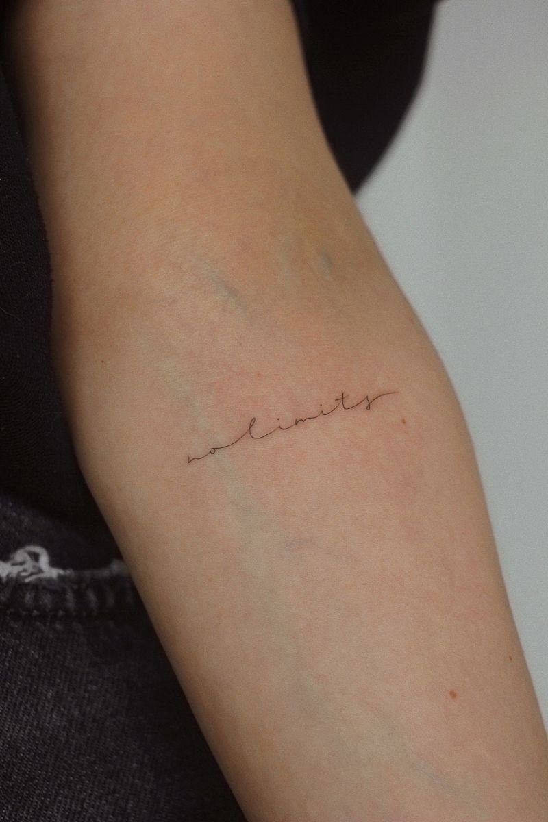
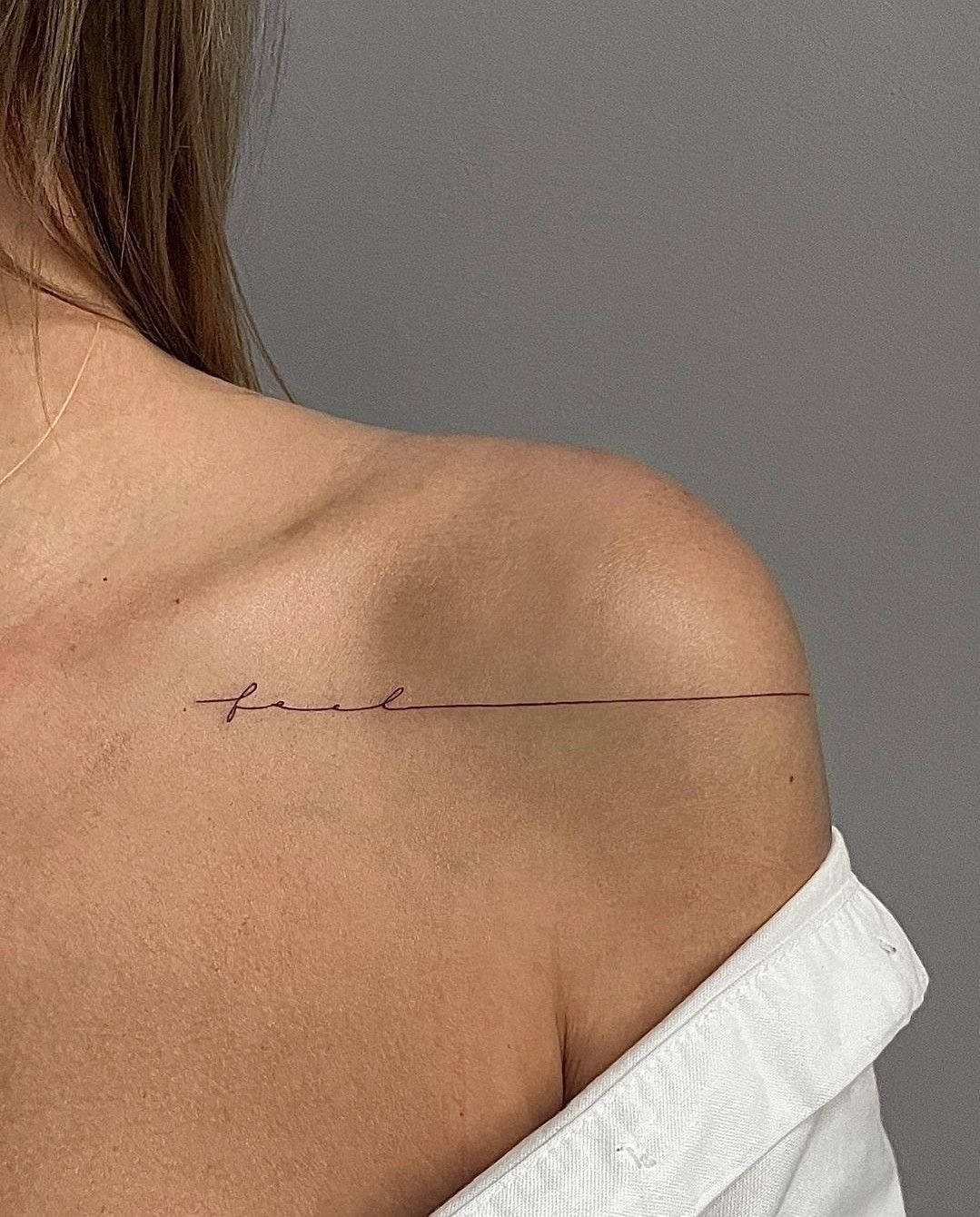
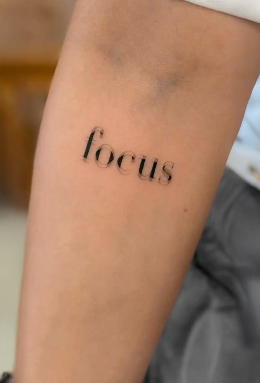
Casual script — looser, less formal, closer to natural handwriting — is the dominant style for contemporary fine-line lettering tattoos. The trend of the 2020s has been toward increasingly minimal script: small words in a handwritten style, often on the wrist, the inner forearm, or behind the ear, with no flourishes and little variation in stroke weight. This style is visually connected to the fine line and minimalist movements and shares their ageing characteristics.
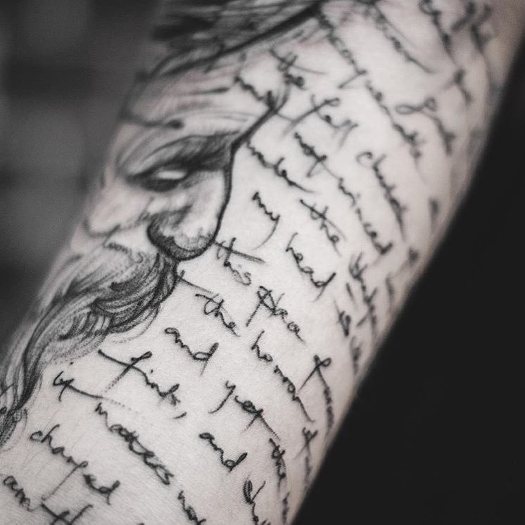
Handwriting tattoos — text rendered in a specific person’s actual handwriting — are a significant subcategory. The client provides a handwritten sample (a note from a parent, a letter from a friend, a phrase written by a child), and the artist reproduces it on skin. The personal nature of the source gives the tattoo its meaning; the challenge is to reproduce the handwriting’s specific quirks and irregularities accurately, because the charm of the piece depends on it looking like the original rather than a cleaned-up version.
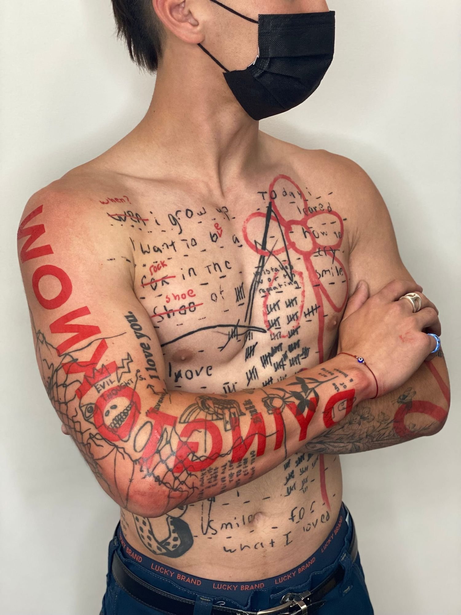
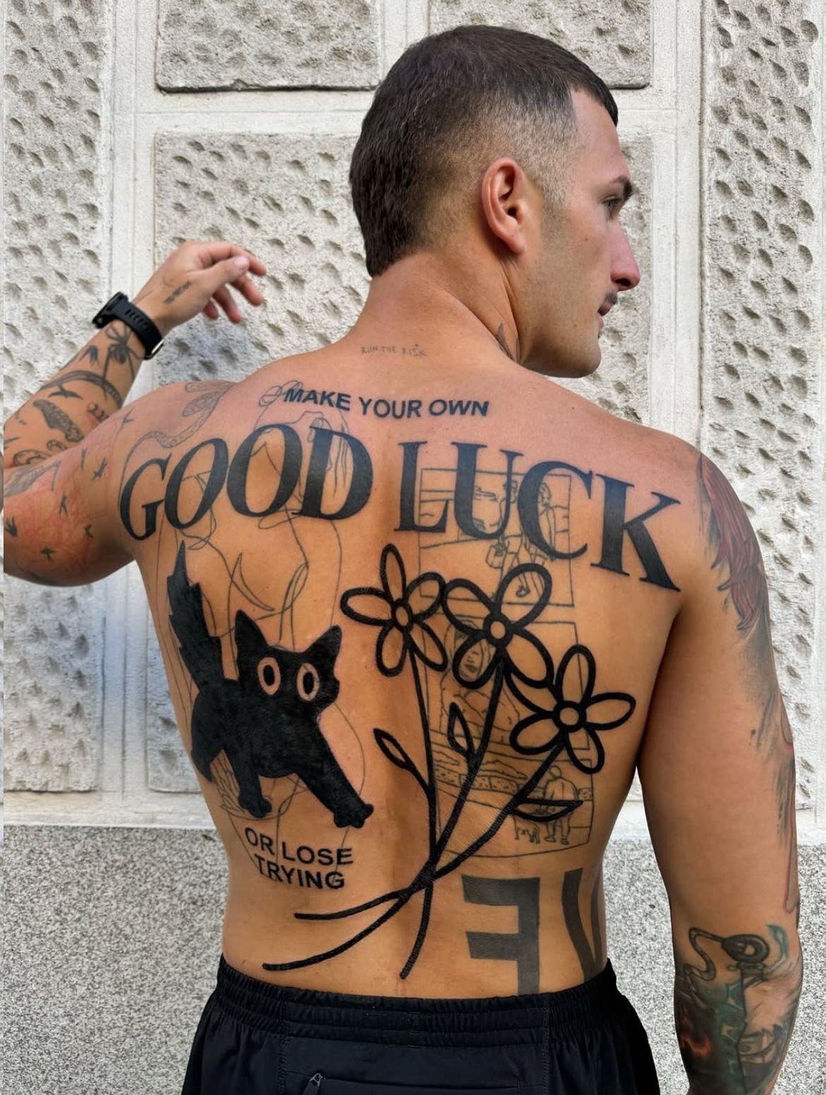
Serif and sans-serif
Typographic lettering — letter forms drawn from the vocabulary of printed type rather than from handwriting — is a smaller but distinct category. Serif fonts (letters with small finishing strokes at the ends of the main strokes — Times New Roman is the most familiar example) produce formal, traditional-looking tattoos. Sans-serif fonts (letters without serifs — Helvetica, Futura, Arial) produce a cleaner, more modern appearance.
Roman numerals are almost always rendered in a serif style and are among the most common typographic lettering tattoos — for dates of birth, memorial dates, and significant years.
Typewriter fonts — monospaced, slightly irregular, resembling the output of a manual typewriter — are a popular contemporary choice, associated with literature, writing, and a deliberately imperfect aesthetic.
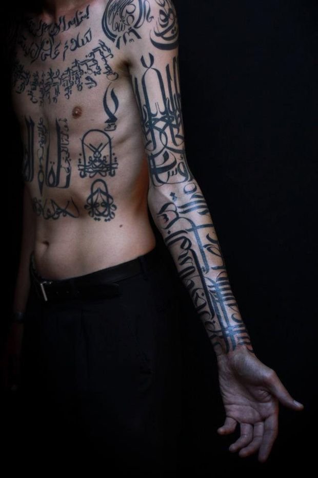
Arabic calligraphy
Arabic is a calligraphic tradition of extraordinary beauty and complexity, with multiple script styles (naskh, thuluth, diwani, nasta’liq, and others), each with its own formal rules. Arabic reads right to left, the letters connect in specific ways depending on their position in a word, and the visual balance of a phrase depends on the calligraphic traditions that govern the script.
A tattoo in Arabic script requires either an artist fluent in Arabic calligraphy or very close collaboration with a native reader and a calligrapher. The risks of error — incorrect letter connections, wrong letter forms, misspelling, or nonsensical text — are high when the artist does not read the script.
The additional cultural consideration: tattooing is generally considered haram in mainstream Islamic jurisprudence, and tattooing Quranic text or religious Arabic phrases involves specific sensitivities that the client should understand.
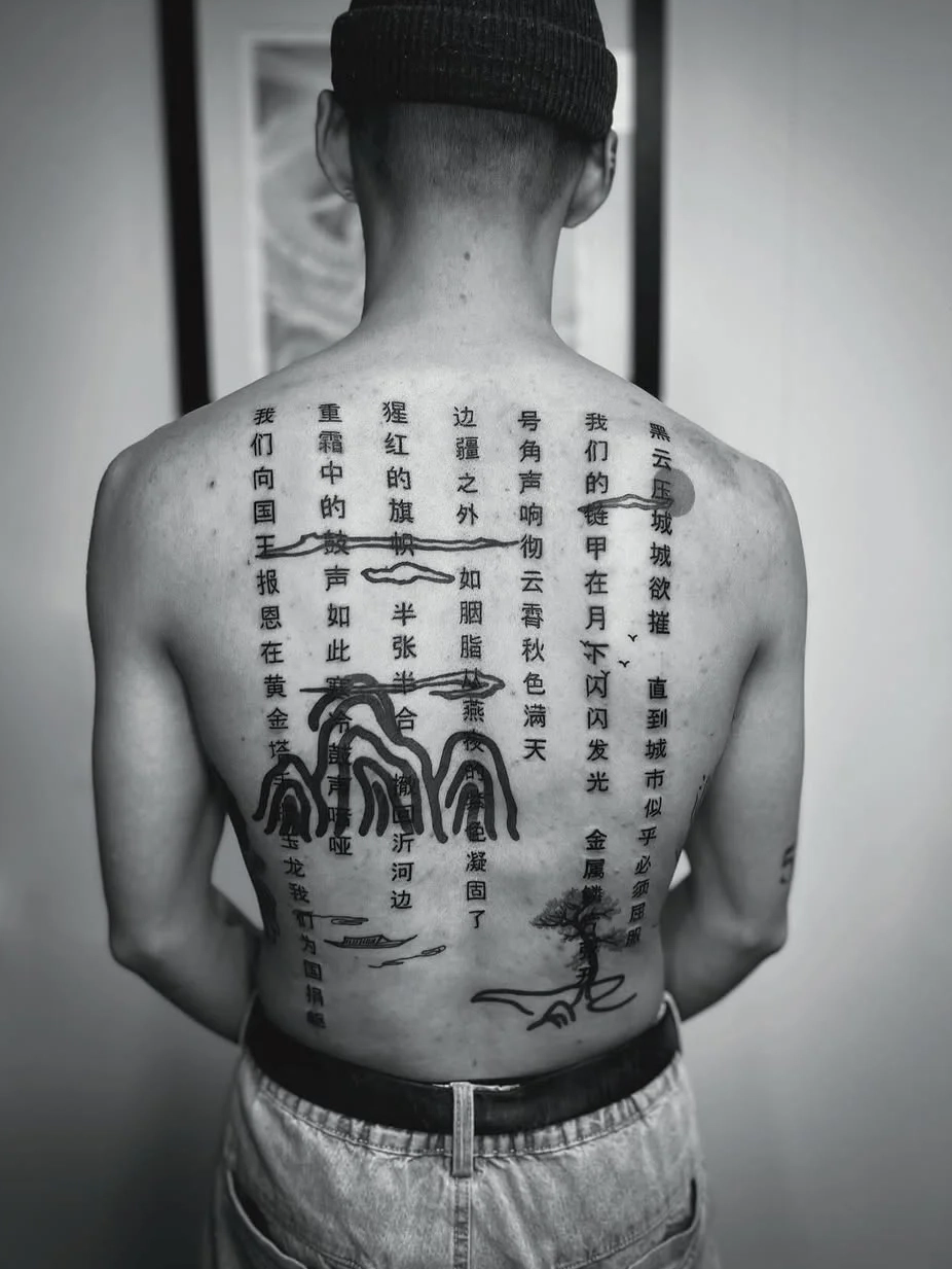
Chinese characters and Japanese kanji
Chinese characters (hanzi) and their Japanese readings (kanji) are frequently requested as tattoo subjects. The risks are well documented: incorrect characters, characters that mean something different from what the client intended, characters that are grammatically or contextually wrong, and characters that are simply gibberish. The internet is full of examples. The practical guidance is the same as for Arabic: either work with an artist who reads and writes the language, or have the text verified by a native reader before it is tattooed.
Hebrew
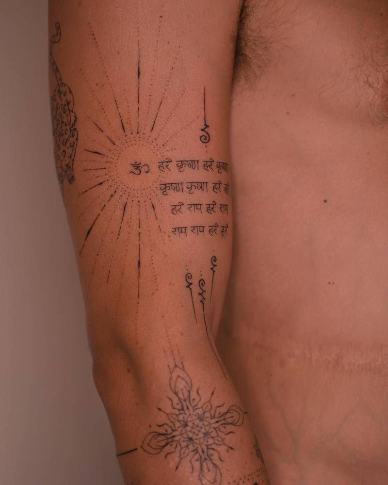
Sanskrit and Devanagari
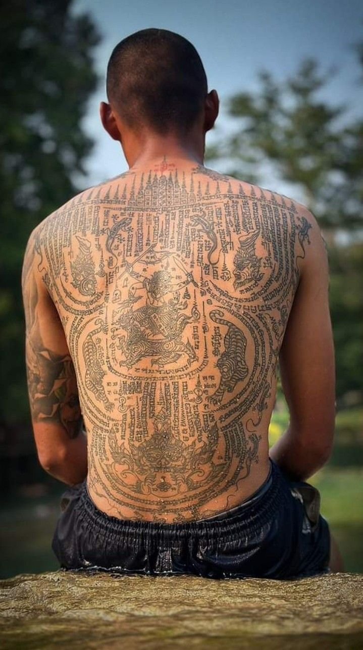
Thai
Korean (Hangul)
What separates good lettering from bad
Consistency
Every letter in a word should share the same baseline (the line the letters sit on), the same x-height (the height of the lowercase letters), the same stroke weight distribution, and the same angle. Inconsistency in any of these — one letter taller than its neighbours, one stroke heavier than the others, one letter at a different slant — reads as amateur work and cannot be corrected after healing.
Spacing
The space between letters (kerning) and the space between words must be optically even — not mechanically even (the same measured distance between every pair of letters) but visually even (the letters appear to be spaced regularly, which requires adjusting the physical spacing to compensate for the different shapes of different letters). The letter combination AV requires less physical space than HH to look evenly spaced, because the diagonal strokes of the A and V create visual space within their forms. An artist who does not understand optical spacing will produce lettering that looks uneven even when the physical measurements are identical.
Line quality
A lettering line must be confident, smooth, and executed without hesitation. Every wobble, every start-stop mark, every inconsistency in line width is visible in a lettered word, because the viewer’s eye is trained from birth to read letterforms and detects errors automatically. The line quality demands of lettering are among the highest in tattooing — a line that would be acceptable in a figurative piece may be unacceptable in a letter.
Composition on the body
A word or phrase must be sized and placed to sit correctly on the body part it occupies — following the curvature of the ribs, fitting the width of the forearm, centring on the spine or the sternum. A word that is too long for the available space will be compressed at the end; a word placed without regard for the body’s curvature will appear to droop or tilt. Composing lettering for the body requires the artist to think about the three-dimensional surface, not about the word as it appears on a flat screen.
Readability
The text must be legible. This sounds obvious, but ornate lettering styles — elaborate blackletter, heavily flourished Chicano script, highly stylised calligraphy — can sacrifice readability for visual richness. The balance between ornamentation and legibility is one of the central design decisions in lettering work, and the best lettering artists maintain readability even in the most elaborate styles.
Ageing
Lettering ageing depends on the weight of the letter strokes and the text size.
Bold, heavy lettering — blackletter at large scale, heavy serif, thick script — ages well. The strokes are wide enough to absorb the slight thickening that comes with pigment migration over time, and the letterforms remain readable for decades. A large blackletter word across the upper back, applied in 2005, will still be legible in 2035.
Medium-weight script — Copperplate, formal cursive, Chicano script — ages well when executed with sufficient line weight and with well-packed ink. The thin-thick transitions in these styles mean that the thinnest strokes are the most vulnerable, and the contrast between thick and thin will diminish slightly over time. The letters remain readable, but the elegance of the transitions softens.
Fine-line and minimal script — the thin, unvaried handwriting-style script popular in contemporary fine line tattooing — ages less reliably. The lines are often at or near the minimum weight that the skin can hold over time. At a small scale on high-exposure placements (the wrist, the fingers, behind the ear), fine script can become difficult to read within five to ten years. Closely spaced letters may merge. Thin strokes may thicken into each other.
Colour and shading in lettering. Shadows and gradient fills in Chicano and other shaded lettering styles age the way all greywash ages — the lightest tones lift, the gradients flatten slightly, and the three-dimensional effect diminishes. The letter forms themselves remain, but the dimensional quality softens.
The practical advice: the longer you want the text to last, the bolder the stroke weight should be. A word intended for a lifetime should be rendered at a weight and a scale that will survive the skin’s ageing process without losing legibility.
Common mistakes
Spelling mistakes. The single most embarrassing and preventable error. Every piece of text should be verified by both artist and client — in writing, before the stencil is applied — and checked again on the skin before the machine starts. Despite this, misspelt tattoos remain common.
Incorrect translations. Text in a language the client does not speak, translated with Google Translate or a similar tool, is among the highest-risk categories in tattooing. Machine translation frequently produces grammatically incorrect, contextually wrong, or outright meaningless results. Human verification by a native speaker is the only reliable method.
Poor placement. Text that is too long for the available space, text that does not follow the body’s contour, text placed at an angle that reads correctly from one viewpoint and incorrectly from another. Placement errors in lettering are especially visible because the viewer reads the text and expects it to sit the way text sits on a page — horizontally, evenly, with consistent spacing.
Spelling mistakes. The single most embarrassing and preventable error. Every piece of text should be verified by both artist and client — in writing, before the stencil is applied — and checked again on the skin before the machine starts. Despite this, misspelt tattoos remain common.
Font selection from a screen. Choosing a font on a computer screen and printing it as a stencil, without adaptation for the body, produces lettering that sits flat and mechanical on the skin. The best lettering artists draw the letters by hand — adapting the forms to the body, adjusting the spacing optically, and giving the letterforms a quality of line that a printed font cannot produce. A hand-lettered tattoo and a font-printed tattoo are visually distinguishable, and the hand-lettered version is almost always stronger.
 | Inkscript")
 | Inkscript")
Choosing a script and lettering tattoo artist
Look for a lettering portfolio. An artist who specialises in lettering — or who has a substantial body of lettering work in their portfolio — is a safer choice than an artist whose portfolio is primarily figurative. Lettering requires a specific skill set (understanding of letterform construction, optical spacing, and composition on the body), and generalists may not have developed it.
Identify the tradition. A Chicano lettering specialist will produce the strongest Chicano work; a calligraphy-trained artist will produce the strongest formal script; a fine-line artist will produce the strongest minimal handwriting-style text. Matching the tradition to the intention produces better results.
Ask whether the artist draws the lettering or prints a font. Hand-drawn lettering, adapted to the body, is the standard of quality in the field. Font-based stencils are the shortcut. Some artists use a font as a starting point and modify it by hand; this is a reasonable middle ground. An artist who applies an unmodified digital font as a stencil is not doing lettering work — they are doing printing work.
Verify text in non-Latin scripts. If the text is in a language or script the artist does not read, insist on verification by a native reader before the stencil is applied. This is the client’s responsibility as much as the artist’s.
Check healed work for line consistency and spacing. The healed photograph reveals whether the letterforms held their weight, whether the spacing remained even, and whether the thinnest strokes survived the healing process. These are the quality markers that distinguish a good lettering tattoo from a mediocre one.
Sources & further reading
- Chaz Bojórquez, Chaz Bojórquez: New World Order. Drago, 2009.
- Sir Twice, Chicano Style Lettering Guide. Published through Big Sleeps Ink.
- Freddy Negrete with Steve Jones, Smile Now, Cry Later: Guns, Gangs, and Tattoos — My Life in Black and Gray. Seven Stories Press, 2016.
- Gerrit Noordzij, The Stroke: Theory of Writing. Hyphen Press, 2005.
- Edward Johnston, Writing & Illuminating & Lettering. John Hogg, 1906.
Hermann Zapf, About Alphabets: Some Marginal Notes on Type Design. MIT Press, 1970.
Robert Bringhurst, The Elements of Typographic Style. Hartley & Marks, 1992.
Stan Knight, Historical Scripts: From Classical Times to the Renaissance. Oak Knoll Press, 1998.
Albert Kapr, The Art of Lettering: The History, Anatomy, and Aesthetics of the Roman Letter Forms. K.G. Saur, 1983.
Yasin Hamid Safadi, Islamic Calligraphy. Thames & Hudson, 1978.
Annemarie Schimmel, Calligraphy and Islamic Culture. New York University Press, 1984.
Anna Felicity Friedman, The World Atlas of Tattoo. Yale University Press, 2015.
Matt Lodder, Painted People: Humanity in 21 Tattoos. Harper, 2024.
Margo DeMello, Bodies of Inscription: A Cultural History of the Modern Tattoo Community. Duke University Press, 2000.