Illustrative tattooing style
Illustrative: Tattooing that takes from drawing
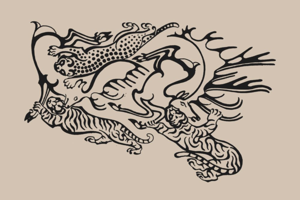
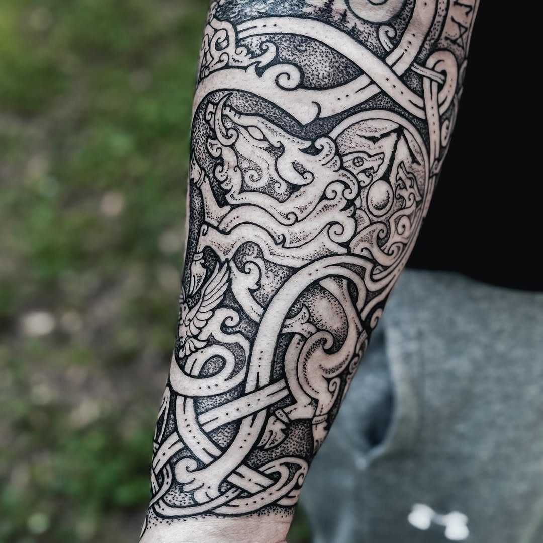
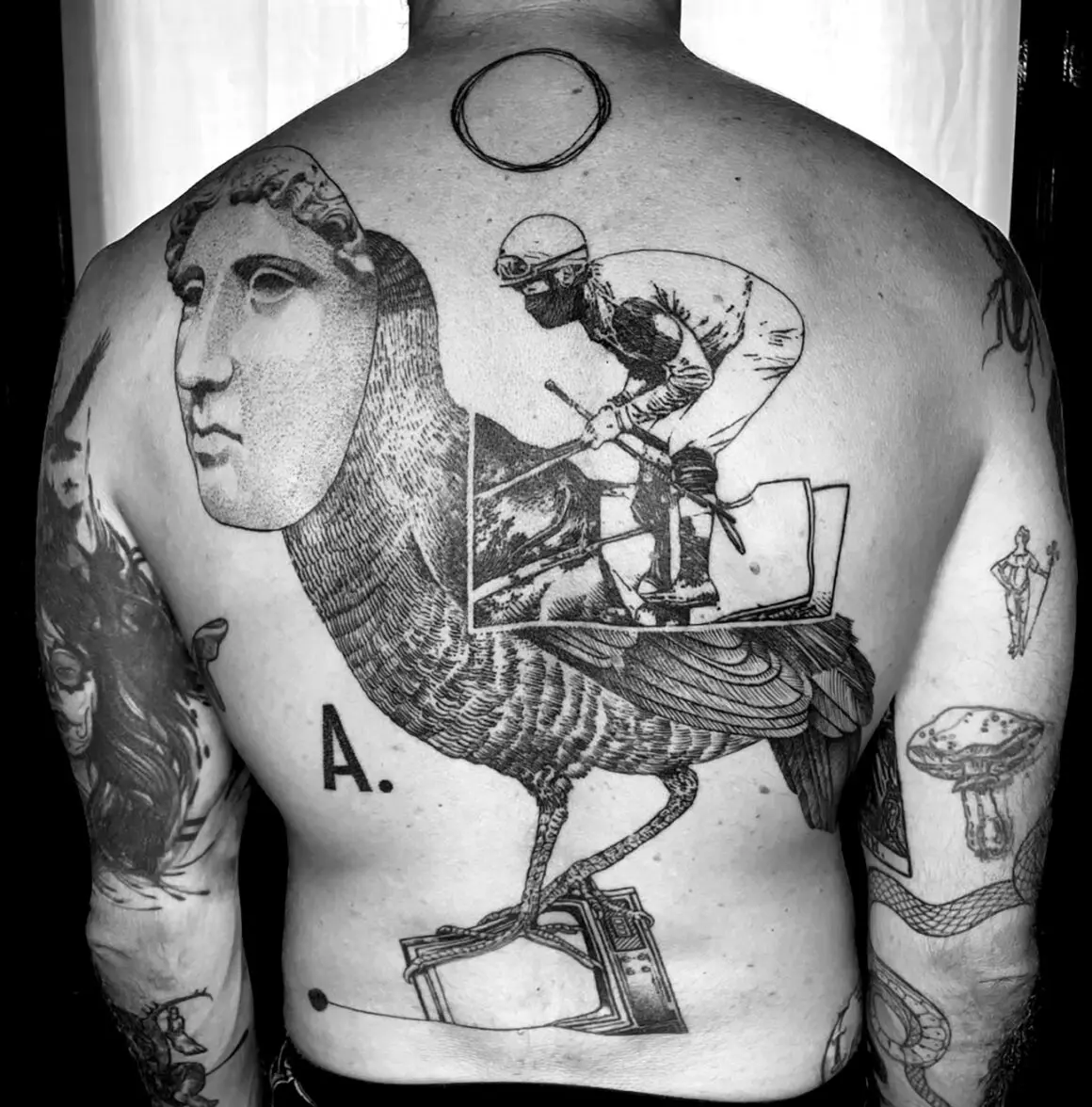
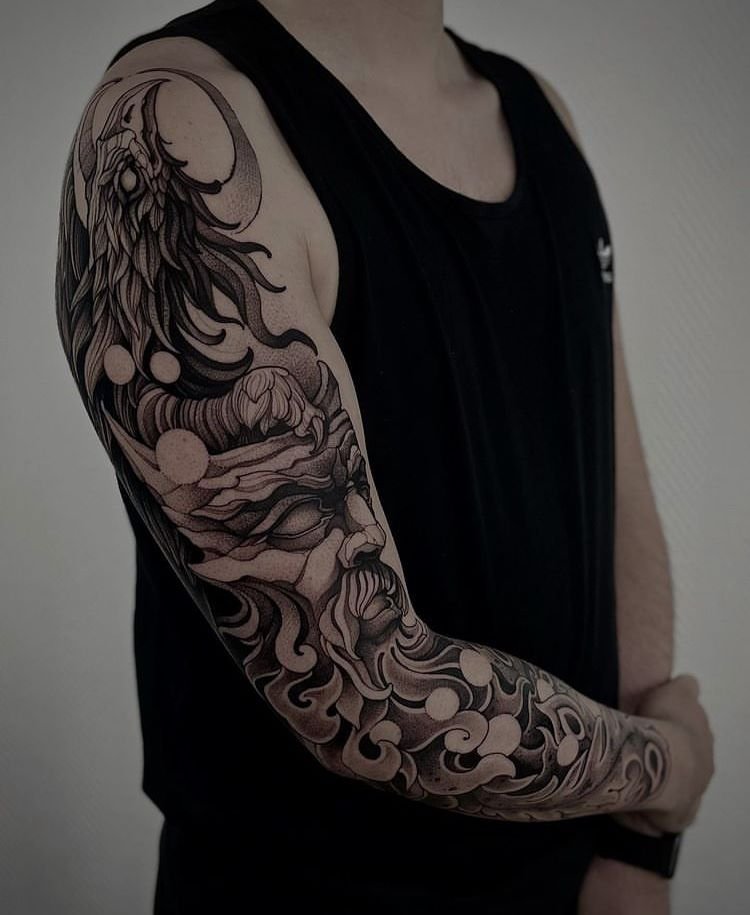
A fox curled in a thicket of ferns, rendered in fine ink lines with cross-hatched shadows, looking like it was lifted from a Victorian natural history plate. A human heart drawn with anatomical precision and surrounded by wildflowers, as though pulled from a medical textbook and placed in a garden. A full sleeve of interlocking figures, creatures, and landscapes composed like the margins of a medieval manuscript. These are illustrative tattoos, and the term describes exactly what they look like: illustrations on skin.
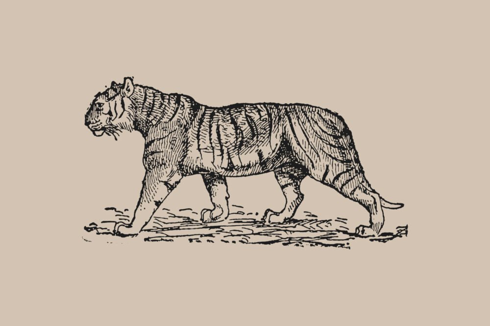
Illustrative tattooing is the style that draws most directly from traditions outside tattooing — from book illustration, from printmaking, from pen-and-ink drawing, from etching, woodcut, engraving, and lithography. Where American traditional draws from flash sheets and Japanese irezumi draws from ukiyo-e and painted scrolls, illustrative work draws from the printed page. The visual references are specific: Arthur Rackham’s fairy tale illustrations, Albrecht Dürer’s engravings, Gustave Doré’s biblical plates, Ernst Haeckel’s biological prints, the anatomical drawings of Andreas Vesalius, the botanical plates of Pierre-Joseph Redouté, the pen-and-ink work of Aubrey Beardsley, and the etchings of Rembrandt. These are the sources, and the style looks the way it does because it is trying to produce, on skin, the same qualities those sources produce on paper.
This is the style’s strength and its central problem. Paper and skin are different media. Ink on paper stays where you put it; ink in the dermis migrates. Paper does not stretch, swell, scar, or tan. A technique optimised for the printed page — fine cross-hatching, delicate stipple, hairline contours — does not automatically translate to a medium that blurs over decades.
What makes a tattoo illustrative
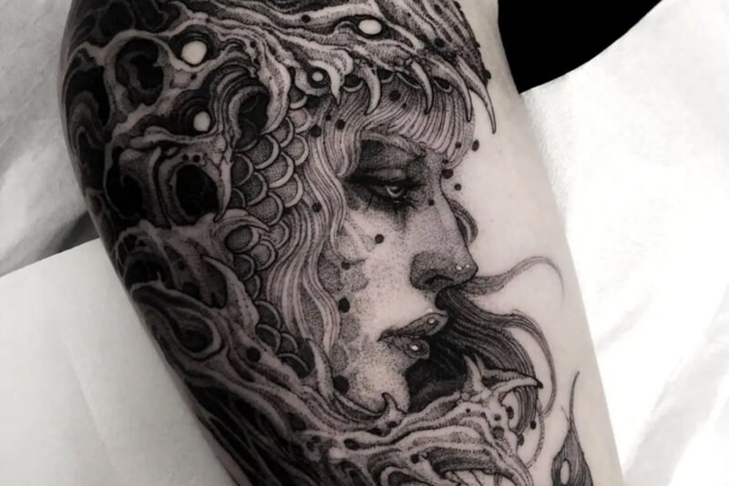
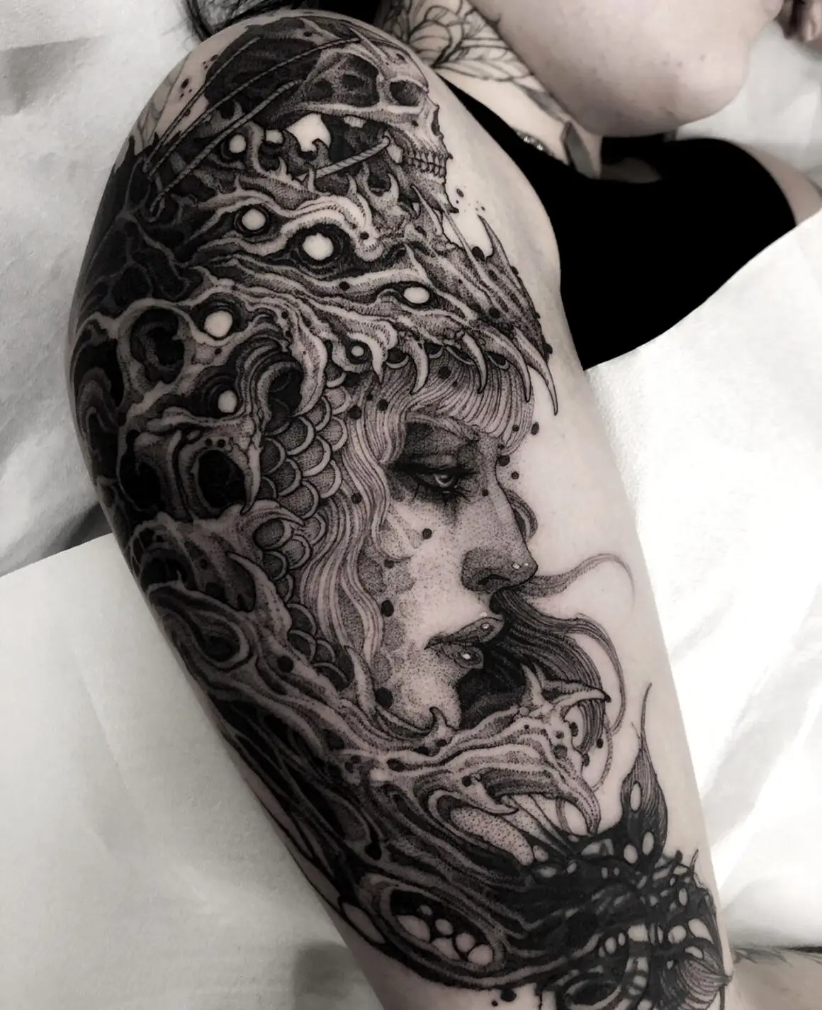
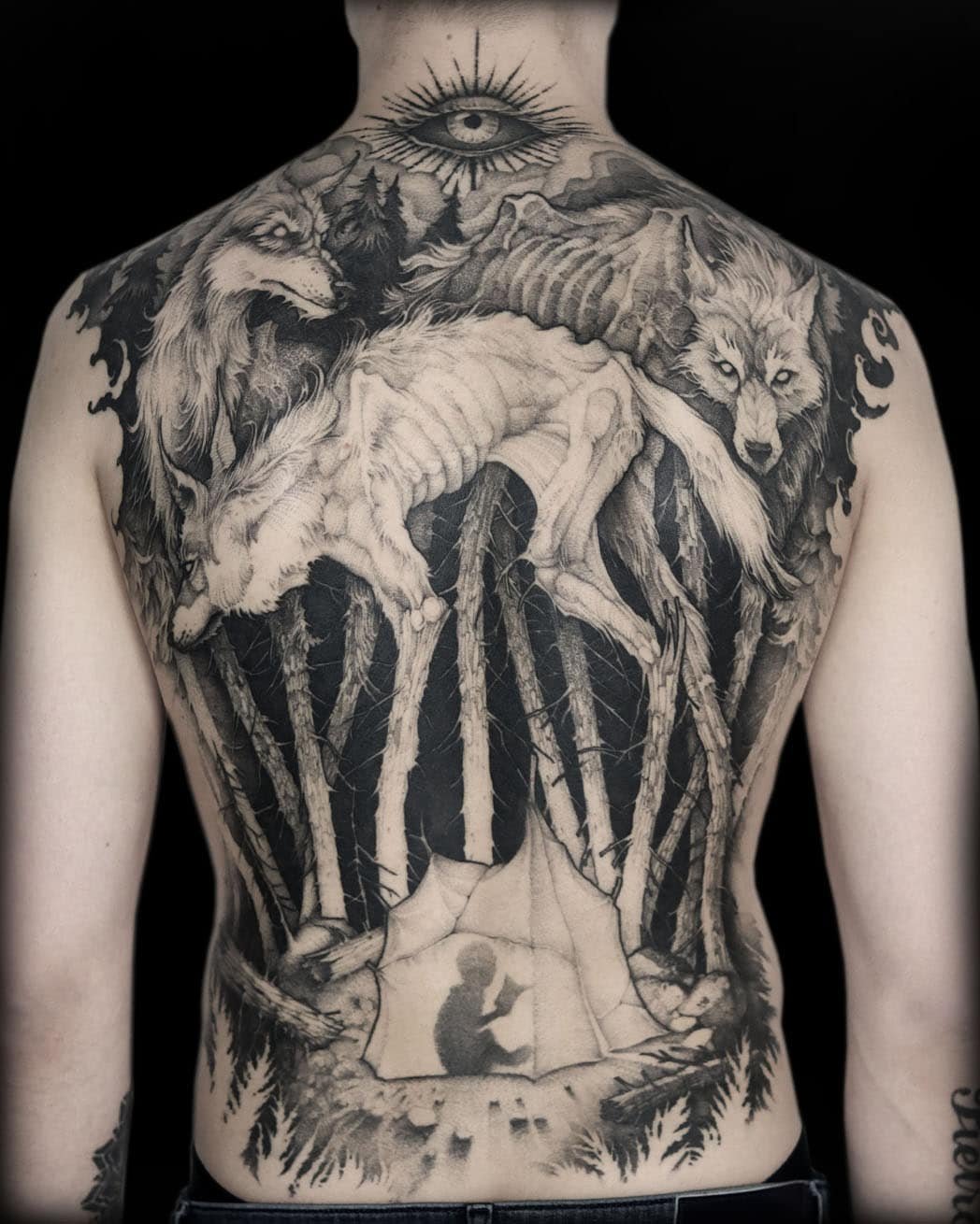
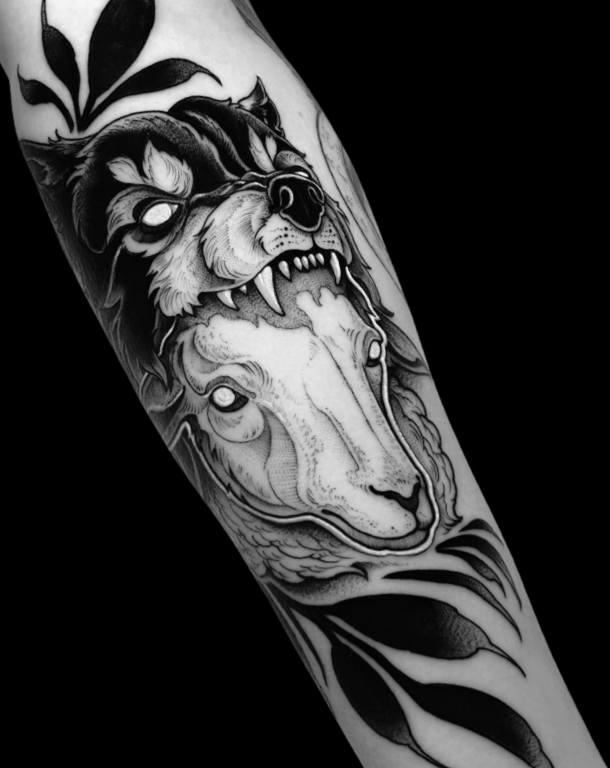
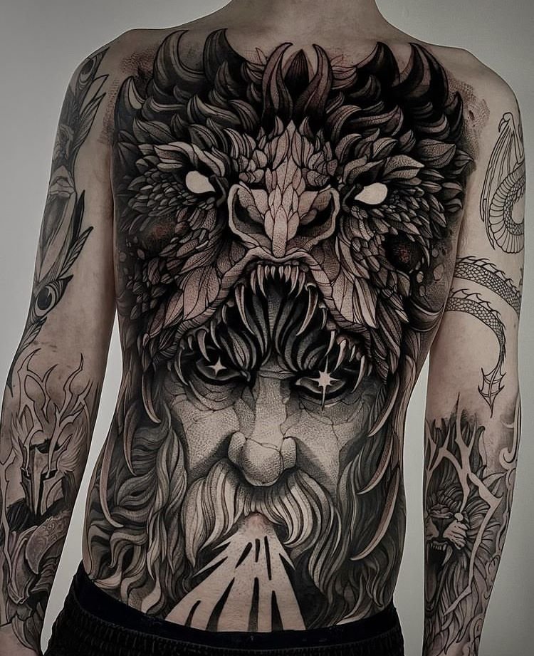
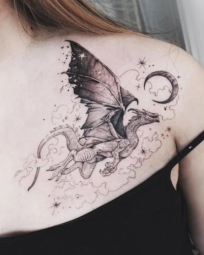
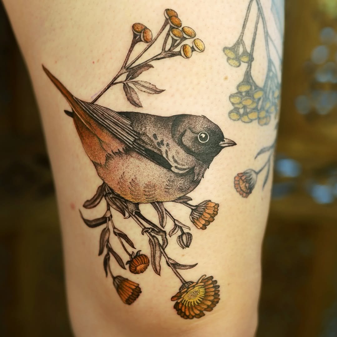
The line carries the image. In illustrative work, the drawn line is the primary visual element. Outlines, contour lines, hatching lines, and detail lines are all visible as lines — the viewer sees the drawing, not a filled shape. This is the fundamental difference from styles like realism (where line is subordinate to tonal rendering) and traditional (where line is a bold boundary containing flat colour). An illustrative tattoo looks drawn because the drawing is the point.
Shading is built from mark-making. Where realism uses smooth tonal gradients and traditional work uses stippled or solid-black shading, illustrative work builds its tonal range from visible marks — cross-hatching, parallel hatching, stippled dots, and other mark-making techniques borrowed from printmaking and pen-and-ink drawing. The marks are part of the image’s texture and character. A cross-hatched shadow on an illustrative piece is meant to be seen as cross-hatching, not as a smooth grey tone. The technique is the aesthetic.
The visual reference is to print, not to photography. Illustrative tattoos aim to look like drawings, prints, or engravings — not like photographs or traditional tattoo flash. The distinction is partly about line quality (drawn rather than graphic), partly about shading technique (mark-making rather than smooth wash), and partly about composition (illustrative pieces often use the framing conventions of book illustration — vignettes, borders, decorative frames, compositions that imply a page).
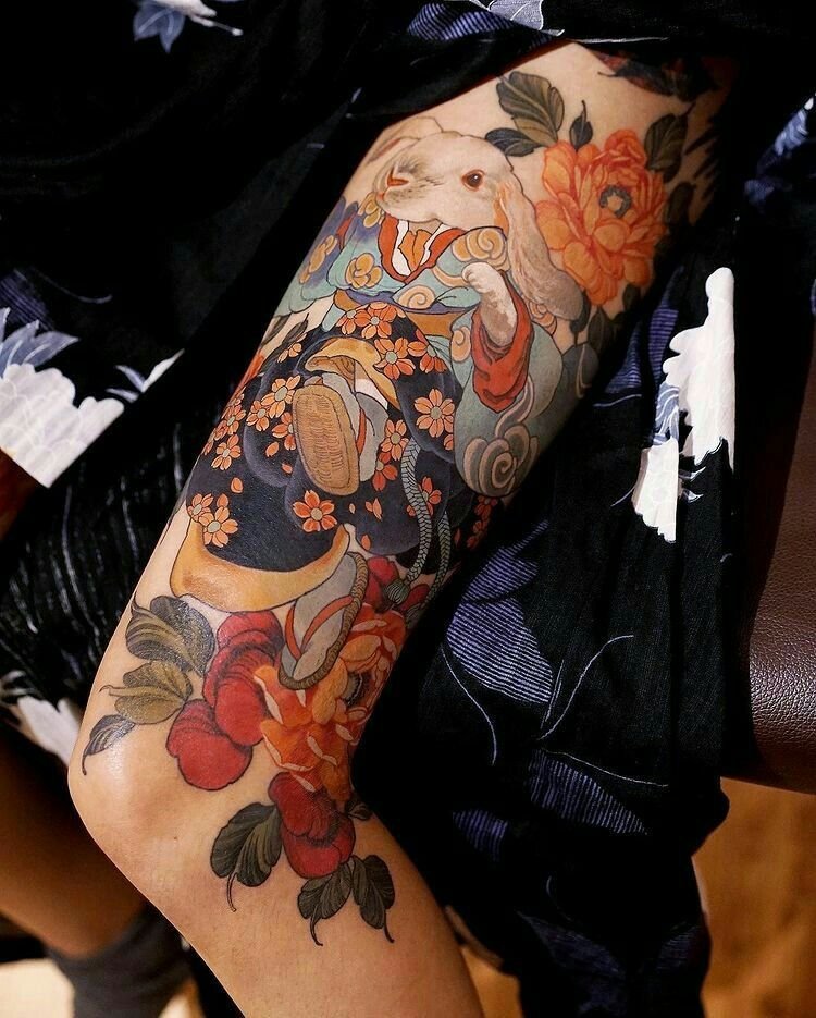
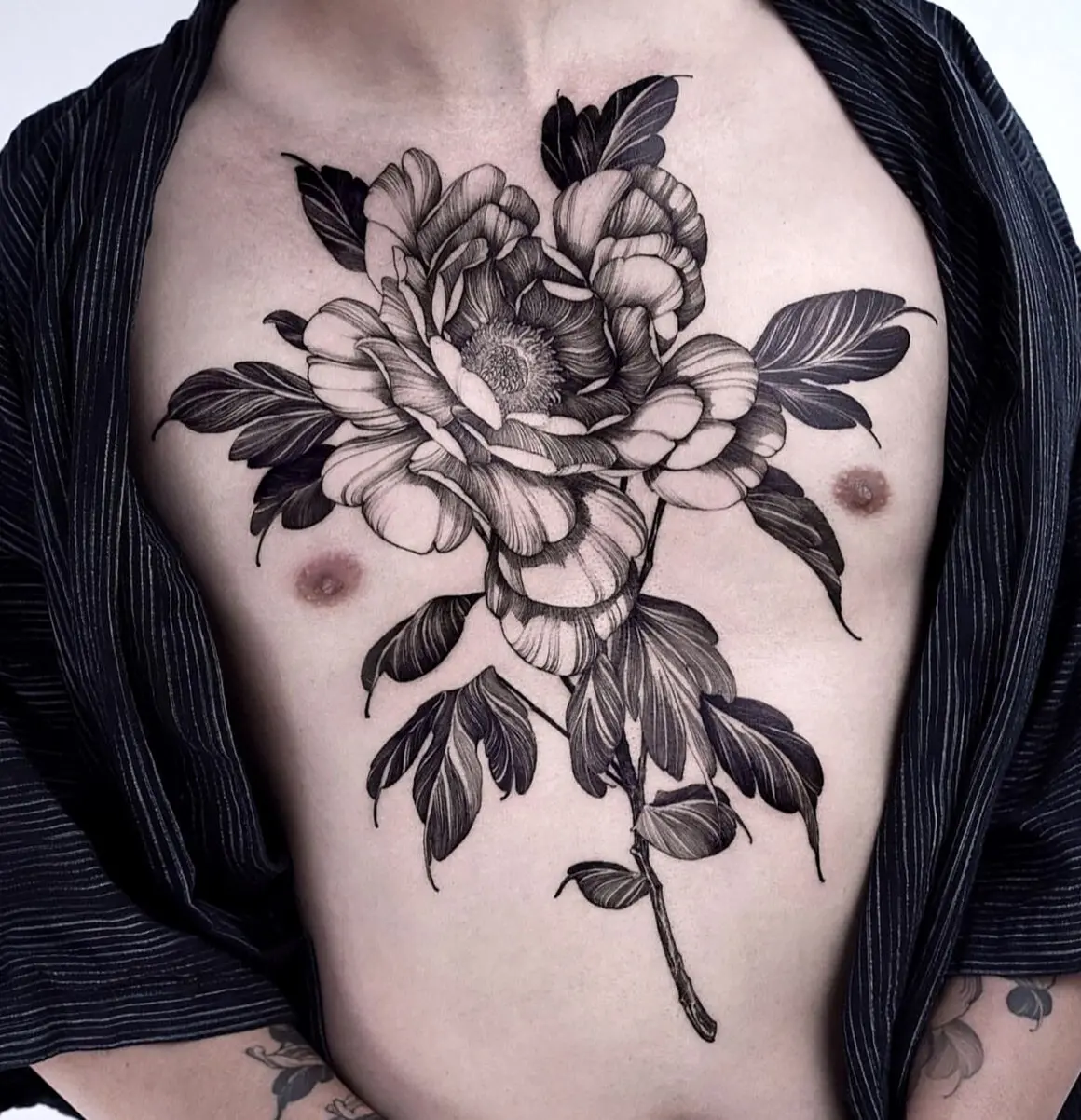
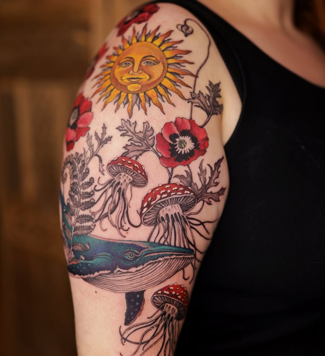
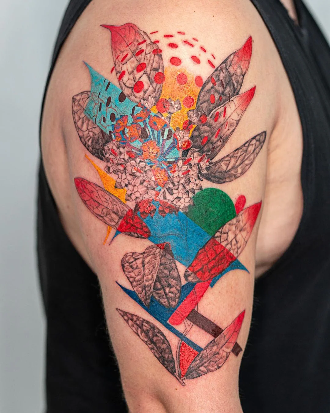
Colour is optional and often restrained. Many illustrative tattoos are done in black ink only. When colour is used, it tends to be applied sparingly — a single accent colour, a watercolour-style wash behind a line drawing, or a limited palette of muted tones. Full-spectrum saturated colour is rare in the style because it pulls the image away from the drawn-on-paper quality that defines the aesthetic.
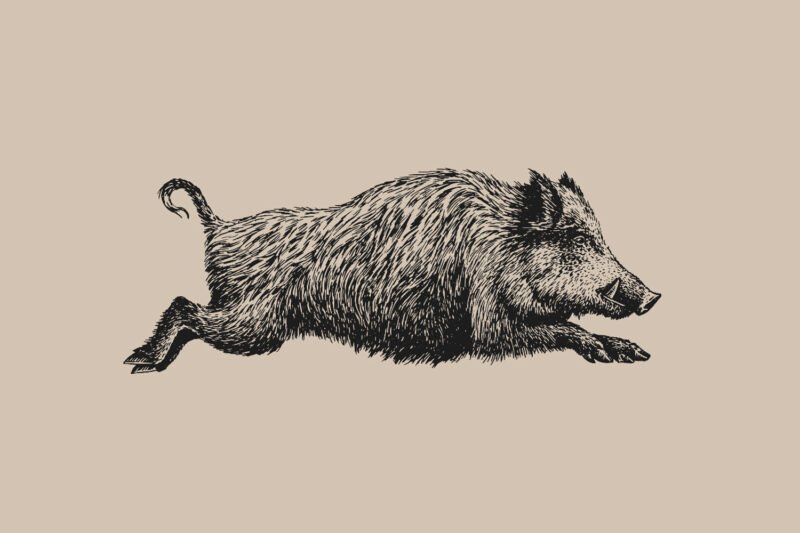
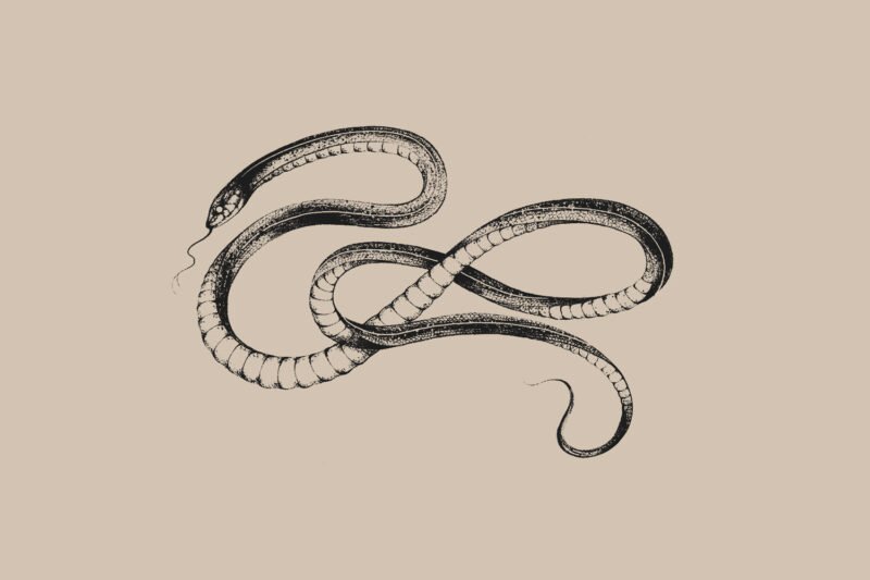
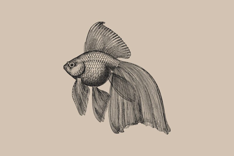
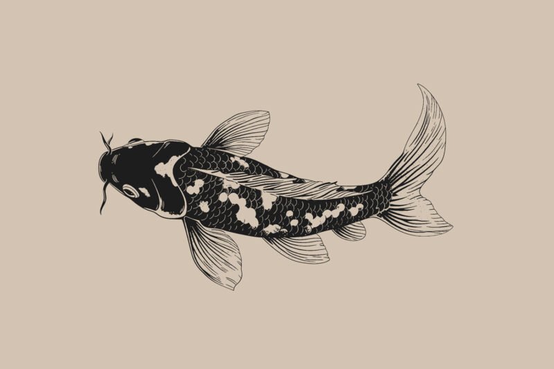
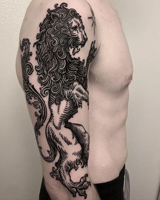
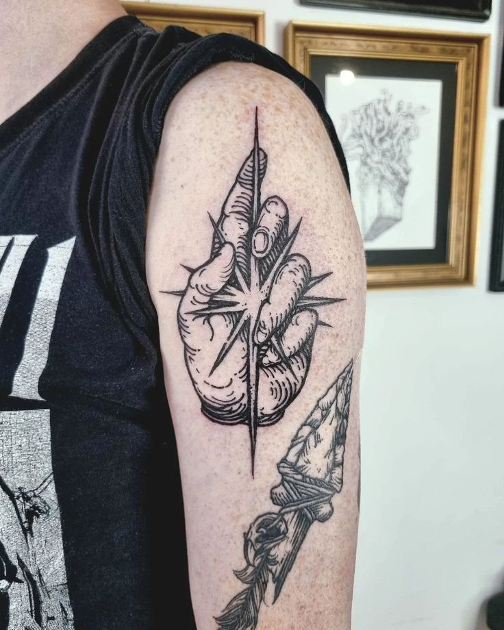
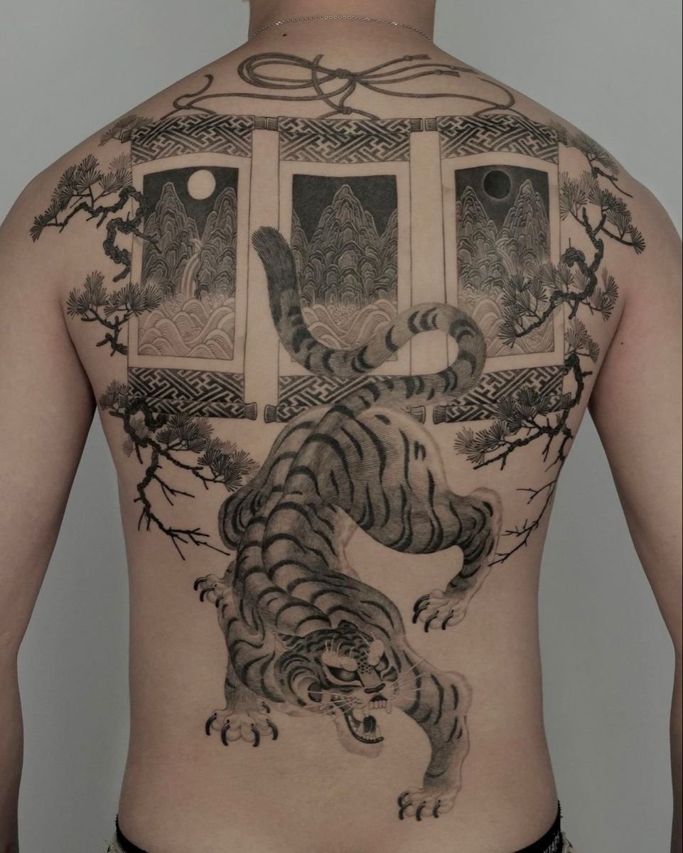
Subject matter is wide but tends toward the narrative and the natural. Animals, plants, human figures, mythological scenes, literary references, anatomical subjects, architectural elements, maps, celestial imagery, and composite compositions that combine several of these. The illustrative vocabulary is broad, but it tends toward subjects that have a history in illustration — things that have been drawn in books, in field guides, in fairy tales, in anatomical atlases, in bestiaries.
Where it comes from
Several developments converged.
The broadening of the tattoo artist base. From the 1990s onward, increasing numbers of people with formal art training — fine art degrees, illustration degrees, printmaking backgrounds — entered tattooing. Earlier generations of tattooers had mostly learned through apprenticeship in the trade; the newer generation often arrived with drawing skills developed outside the trade. These artists brought visual references and technical habits from their training, and the illustrative style is partly the result of applying those references and habits to skin.
The influence of specific illustration traditions. The golden age of book illustration (roughly 1880–1930, spanning Rackham, Dulac, Nielsen, Beardsley, Clarke, and others) produced a body of work that has been continuously in print and continuously influential. The natural history illustration tradition (Haeckel, Audubon, Redouté, the anonymous botanical and zoological plate-makers of the eighteenth and nineteenth centuries) produced another. Medical and anatomical illustrations (Vesalius, Grey’s Anatomy plates, Netter) produced a third. Each of these traditions offered a visual vocabulary built on the drawn line, and each has been imported into tattooing by artists who studied and admired the originals.
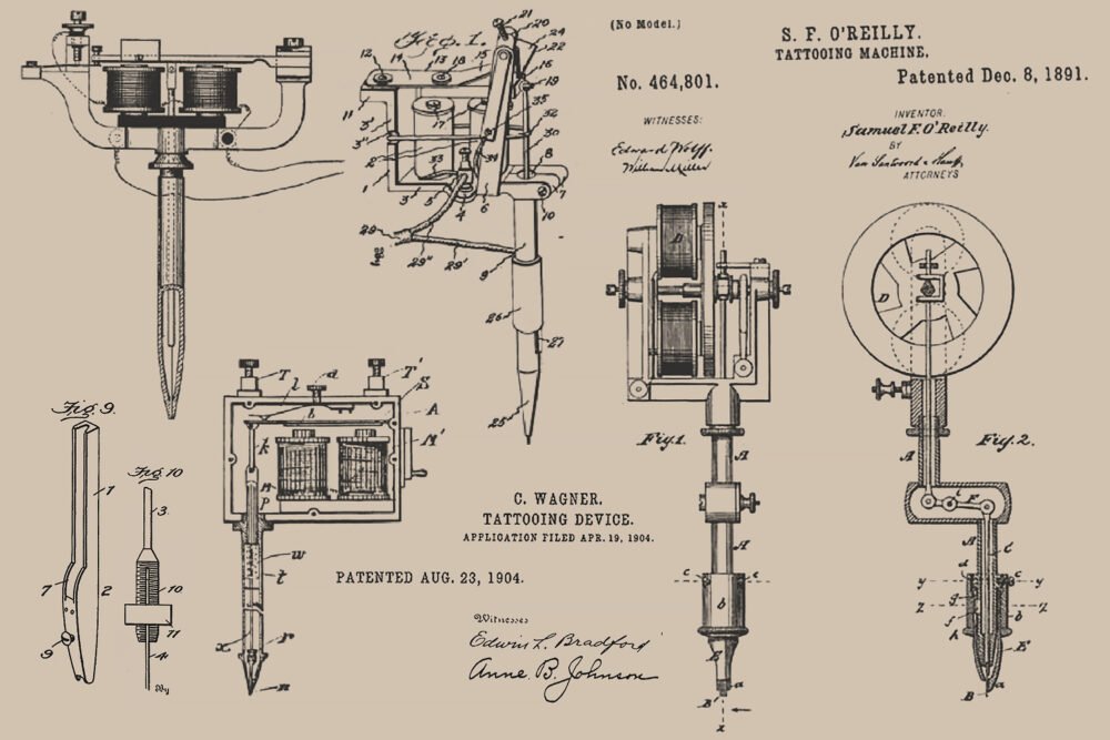
The printmaking connection. Etching, engraving, woodcut, and linocut are all techniques that produce images from lines and marks cut or drawn on a surface. The visual qualities of these media — the precision of an engraved line, the rough texture of a woodcut, the tonal range of an etching — translate well to tattooing because both the print and the tattoo are fundamentally linear media. An etched line on a copper plate and a tattooed line on skin are made by different tools but share a family resemblance, and many illustrative tattoo artists explicitly reference printmaking in their work.
The fine art tattoo crossover. Through the 2000s and 2010s, the boundary between tattooing and the broader art world became more porous. Tattoo artists exhibited in galleries; fine artists got tattooed or took up tattooing; and the idea that a tattoo could be a work of art in the same sense as a print or a drawing gained traction. The illustrative style benefited from this crossover because it is the tattoo style that most closely resembles the work exhibited in galleries and published in art books.
Social media and the portfolio economy. Instagram, which became the dominant portfolio platform for tattoo artists from roughly 2013 onward, rewarded visually distinctive work that read well as a single image on a phone screen. Illustrative tattoos — with their strong graphic quality, their visible mark-making, and their compositional completeness — performed well on the platform. The visibility fed demand, which in turn fed the style’s growth.
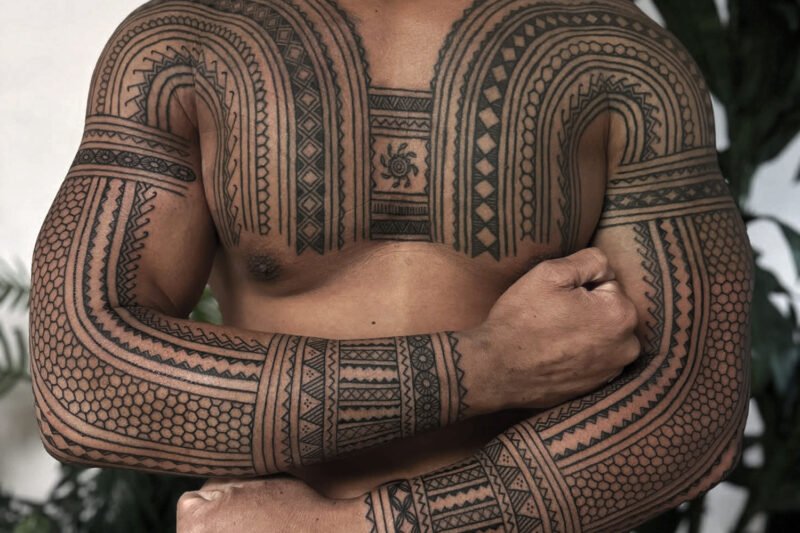
Branches of the illustrative tattoo style

Botanical illustration

Natural history and scientific illustration

Literary and narrative illustration

Dark illustrative

Woodcut and engraving style

Sketch style

Watercolour illustrative
What separates illustrative from adjacent styles
Illustrative vs fine line. Both use thin lines and minimal shading. The difference is in the drawing. Fine line work is often minimal — a simple outline, a small symbol, a single stem — and the aesthetic is about the fineness of the line itself. Illustrative work is about the complexity and character of the drawing: the hatching, the composition, the visible hand of the artist. A fine line rose outline is fine line; a cross-hatched rose with visible construction lines and botanical accuracy is illustrative.
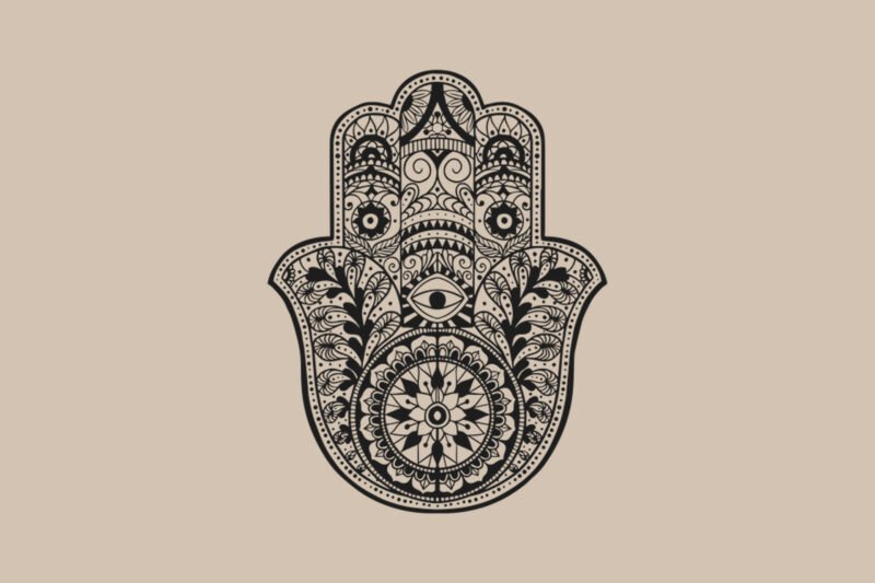
Illustrative vs blackwork. Illustrative blackwork (discussed in the blackwork article elsewhere on this site) sits at the intersection. The distinction, where one exists, is between blackwork, which is primarily about pattern, density, and the contrast between black and skin, and illustrative work, which is primarily about the drawn image and its narrative or representational content. A geometric mandala is blackwork; a detailed pen-and-ink owl surrounded by oak branches is illustrative, even if both are done in black ink.
Illustrative vs neo-traditional. Neo-traditional draws from the same expanded visual vocabulary as illustrative, and the two styles share some sources (Art Nouveau, Golden Age illustration, natural history plates). The difference is structural: neo-traditional keeps the bold outline and the colour-fill logic of American traditional, with an expanded palette and smoother shading. Illustrative work abandons the bold outline in favour of the drawn line and replaces colour fill with mark-making. A peony rendered in saturated colour within a bold outline is neo-traditional; the same peony rendered in cross-hatched pen-and-ink lines is illustrative.
Illustrative vs realism. Both are representational. The difference is that realism aims to look like a photograph, while illustrative work aims to look like a drawing. Realism hides the mark-making; illustrative work displays it. A photographic portrait is realistic; a portrait rendered in visible pen strokes with cross-hatched shadows is illustrative.
Technical demands
Line quality. The drawn line in illustrative work must look intentional and controlled while retaining the quality of a hand-drawn mark. The line is typically thinner and more varied in weight than a traditional outline — it thickens under pressure and thins at turns, mimicking the behaviour of a nib or a brush on paper. Achieving this on skin, where the needle deposits ink differently from any drawing tool, requires practice and a refined understanding of how needle depth, speed, and pressure interact to produce line character.
Hatching and cross-hatching. Building tone from visible parallel lines requires spacing them consistently and at the correct angle, maintaining an even line weight across the set, and achieving smooth tonal transitions by gradually varying the spacing. Cross-hatching — overlaying two or more sets of parallel lines at different angles — adds another layer of difficulty. On paper, these techniques are taught in first-year drawing classes; on skin, they are substantially harder because the surface is curved, soft, and reactive.
Composition. Illustrative tattoos are often compositionally complex — multiple elements arranged in a coherent scene, sometimes with narrative content, sometimes with decorative framing. Composing these pieces for the body — which is three-dimensional, curved, and in motion — is a design skill that goes beyond flat composition on paper. An illustrative sleeve has to read as a coherent image from multiple angles, which requires the artist to think in three dimensions while drawing in two.
Reference management. Many illustrative tattoos are drawn from or inspired by specific source material — a particular Rackham print, a botanical plate, a page from an anatomical atlas. Translating a reference from page to skin requires judgment about what to keep, what to simplify, and what to adapt for the medium. A direct copy of a Doré engraving will not work at tattoo scale because the original was drawn for a printed page at a resolution the skin cannot match. The artist has to understand the source well enough to translate it rather than copy it.
Ageing anticipation. The finest marks in illustrative work — delicate hatching, thin contour lines, subtle stipple — are the first elements to soften as the tattoo ages. An illustrative artist who understands the medium will build structural redundancy into the piece: slightly thicker lines than would be ideal on paper, slightly denser hatching, and strategic use of solid-black anchors to hold the composition together as the lighter elements shift. The best illustrative tattoos are designed for their ten-year appearance, not their first-day appearance.
Ageing and longevity
Pieces with strong structural elements — solid black areas, heavy contour lines, dense hatching — age well. The solid areas hold their form, the heavy lines absorb some spreading without losing definition, and the dense hatching retains enough of its pattern to still read as texture even as individual lines soften.
Pieces built entirely from fine lines and light hatching — with no solid anchors and no heavy marks — soften more noticeably. The finest lines thicken into medium lines. Delicate cross-hatching blurs into a general grey tone. The image is still visible but has lost the crispness that defined it when fresh.
Watercolour elements age fastest. The diffuse, uncontained colour washes that characterise the watercolour branch of the style depend on soft, undefined edges and pale tonal values — exactly the elements that the skin’s natural ageing process attacks first. A watercolour wash that was translucent and delicate at one year may be barely visible at five.
The practical guidance is familiar from other style articles: scale determines detail survivability, placement affects the speed of ageing, and healed photographs are the only honest measure of an artist’s ability. For illustrative work specifically, the additional consideration is the ratio of heavy-to-light marks — a piece with a good balance of solid anchors and finer detail will age more gracefully than a piece built entirely from the lightest possible marks.
Choosing an illustrative artist
Look for a drawing practice. The best illustrative tattoo artists draw independently of their tattoo work — they keep sketchbooks, they make prints, they exhibit drawings. A portfolio that shows drawing skill outside of the tattoo context is a strong indicator that the artist can compose and execute an illustrative piece with real authority. A portfolio that shows only tattoo photographs, with no evidence of independent drawing, may indicate an artist who executes illustrative-looking work without the foundational skill to support it.
Identify the branch. An artist who works primarily in botanical illustration may not be the right choice for a literary narrative scene, and vice versa. The branches of the style draw on different source traditions and require different compositional skills. Identifying which branch matches your intention and finding an artist who works specifically in that branch yields better results than choosing an artist whose portfolio only occasionally touches on the illustrative style.
Check healed work. The advice that applies to every style, and that applies especially here, because the finest marks in illustrative work are the most vulnerable to ageing. Healed photographs at one year and beyond are the test. Fresh illustrative work always looks crisp. The question is whether the hatching still reads as hatching, whether the lines still hold their weight, and whether the composition still works after the settling process.
Discuss the source material. If your piece references a specific illustration tradition or a specific artist’s work, the conversation with your tattoo artist about that reference is part of the design process. A good illustrative tattooer will know the source traditions and have informed opinions on how to translate them into skin. That conversation — about what to keep, what to simplify, and what to adapt — is where the design succeeds or fails.
Illustrative tattoos today
The main risk the style faces is the same risk fine line faces: the social media economy rewards fresh photographs, and the finest illustrative work photographs beautifully when fresh. Whether the artist is designing for the photograph or for the decade is a question the client should ask, and the answer is usually visible in the healed work.
Sources & further reading
- Arthur Rackham, illustrations for A Midsummer Night’s Dream. Heinemann, 1908.
- Arthur Rackham, illustrations for Peter Pan in Kensington Gardens. Hodder & Stoughton, 1906.
- Edmund Dulac, illustrations for Stories from the Arabian Nights. Hodder & Stoughton, 1907.
- Kay Nielsen, illustrations for East of the Sun and West of the Moon. Hodder & Stoughton, 1914.
- Anna Felicity Friedman, The World Atlas of Tattoo. Yale University Press, 2015.
- Matt Lodder, Painted People: Humanity in 21 Tattoos. Harper, 2024.
- Nick Schonberger and Rob Kingston, Forever: The New Tattoo. Gestalten, 2012.
- Margo DeMello, Bodies of Inscription: A Cultural History of the Modern Tattoo Community. Duke University Press, 2000.