Related Posts


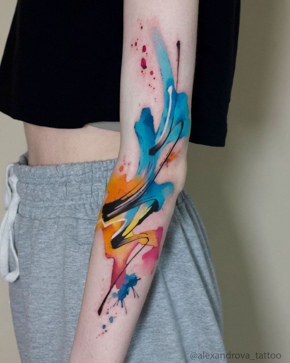
Watercolour
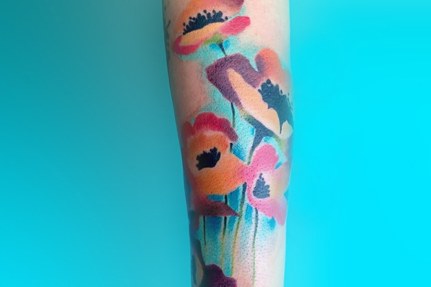
Watercolour paint effect reproduced on skin
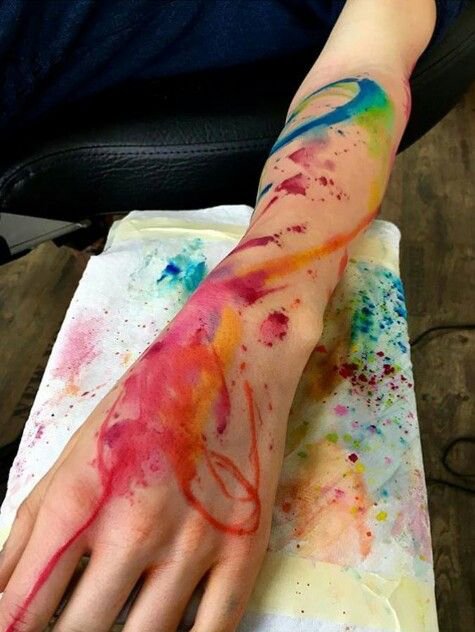
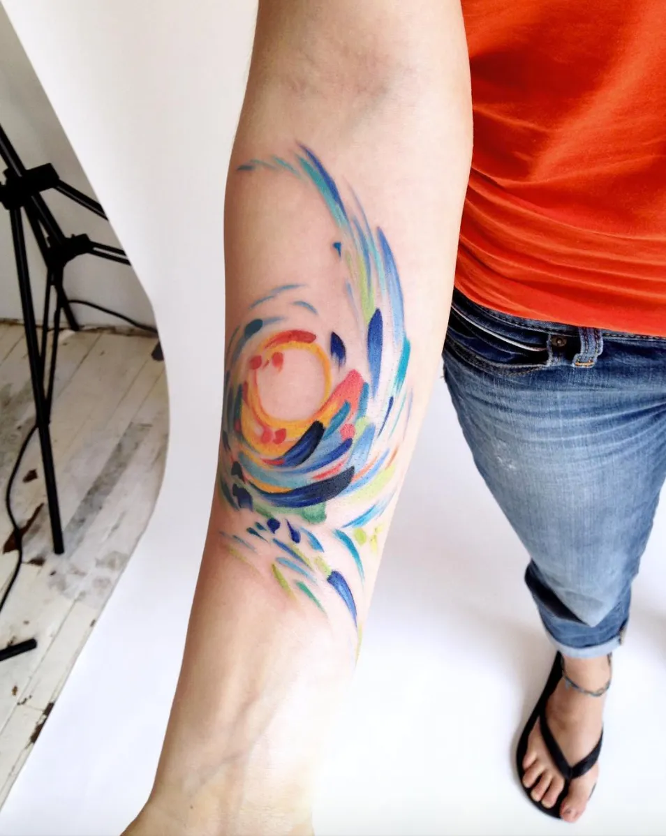
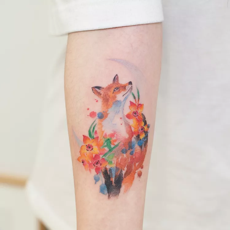
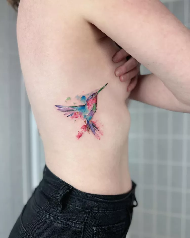
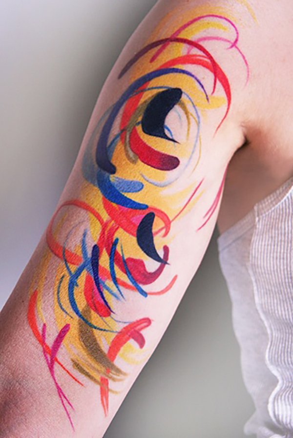
A hummingbird rendered in translucent washes of teal and violet, the colours bleeding past the edges of the body into open skin the way wet pigment bleeds past a pencil line on paper. A sunflower with petals built from layered yellows and oranges, no black outline containing the colour, the edges soft and diffuse. A splash of red and blue that reads as pure abstraction — a brushstroke, a pour, a controlled accident frozen on the forearm.
These are watercolour tattoos. The style takes its name from the painting medium it imitates: watercolour paint on paper, with its characteristic translucency, soft edges, colour bleeding, and apparent spontaneity. The tattoo version attempts to reproduce these visual qualities on skin using tattoo ink and tattoo machines — a translation from one medium to another that is technically demanding, aesthetically distinctive, and the subject of one of the longest-running debates in the tattoo industry.
The debate is about ageing. Watercolour tattoos break one of the oldest rules in tattooing — that a strong black outline is necessary to hold an image together as it ages on skin. The watercolour style deliberately eliminates or minimises the outline, relying instead on colour washes, soft gradients, and diffuse edges to carry the image. Whether this works over the long term — whether a watercolour tattoo at fifteen years still looks like what it was meant to be — is the question that has divided the industry since the style emerged. The answer, as with most things in tattooing, depends on how the work is done.
Watercolour painting
Understanding what watercolour painting actually does helps explain what the tattoo style is trying to reproduce.
Watercolour paint is pigment suspended in a water-soluble binder (usually gum arabic). When applied to paper with a wet brush, the pigment spreads with the water, flowing outward from the point of contact in patterns determined by the paper’s wetness, the surface’s angle, the amount of pigment loaded on the brush, and gravity. The painter controls the medium by controlling these variables — but only partially. Watercolour is a medium that resists total control. The paint does things the painter did not plan, and much of the skill of watercolour painting lies in working with those accidents rather than against them.
The visual characteristics that result: translucency (the paper shows through the paint, giving the colours a luminous quality), soft edges (where the wet paint spread beyond the intended boundary), colour bleeding (where two wet colours meet and merge on the paper), gradient washes (smooth transitions from saturated colour to bare paper), and splatter and drip marks (paint thrown or dropped onto the surface). These are the qualities the tattoo style reproduces.
The reproduction is a simulation. Tattoo ink does not behave like watercolour paint. It does not flow on the skin the way paint flows on paper. It does not produce translucency by letting the substrate show through — tattoo ink is opaque when packed, and the effect of translucency is achieved by depositing less ink, by using diluted colour, or by spacing the needle passes to leave bare skin visible between the deposits. Every watercolour effect in a tattoo — every bleed, every soft edge, every splatter — is built deliberately by the artist, mark by mark, using a machine that deposits ink in a fundamentally different way from a brush.
Where it comes from
Amanda Wachob
Amanda Wachob is the artist most frequently credited as a pioneer of the style. Based in New York, Wachob trained as a fine artist and worked with major art institutions — the Metropolitan Museum of Art, the Rubin Museum of Art, and the Whitney — before and alongside her tattoo career. During her apprenticeship, she began questioning the necessity of the black outline, reasoning that a more realistic or painterly rendering would look more natural without one. She started offering clients the option of dropping the outline entirely, and the response — “I’ve never seen a tattoo like that! It looks like a watercolour painting!” — gave the style its name. Wachob’s approach was abstract rather than figurative; her early watercolour tattoos were fields of colour, brushstrokes, and painterly gestures applied directly to skin.
IG: @amandawachob
Gene Coffey
Gene Coffey of Tattoo Culture in Brooklyn, New York, developed a watercolour approach characterised by fractured imagery and dynamic colour splashes — figurative subjects (birds, animals, human figures) rendered within or emerging from abstract colour fields. Coffey has been vocal about both the potential and the risks of the style, and he is one of the practitioners who has argued for incorporating structural elements (black underwork, strong compositional bones) to ensure the work holds up over time.
IG: @mrcoffeybean
Ondrash
Ondrash (Ondřej Konupčík) from the Czech Republic developed a watercolour practice focused on dreamlike colour blending and one-of-a-kind compositions. His work is noted for its colour sensitivity — the ability to place tones side by side in combinations that create visual depth and movement.
IG: @ondrashtattoo
Sasha Unisex
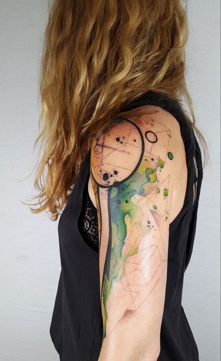
Sasha Unisex from Russia combined watercolour colour washes with geometric shapes and nature-inspired designs, producing a hybrid approach that used geometric structure to anchor the more diffuse colour elements.
IG: @sashaunisex
Baris Yesilbas
Baris Yesilbas, based in New York, developed a practice combining geometric precision with watercolour splashes and gradients — abstract and semi-abstract compositions that use the contrast between hard-edged geometry and soft colour bleeding as a primary visual effect.
IG: @barisyesilbas
Other artists
Other artists who have contributed to the style’s development include Lianne Moule (Immortal Ink, Chelmsford, England), Pablo Ortiz (Toledo, Spain), Rodrigo Tas (Brazil), Candelaria Carballo (Argentina), and June Jung (Korea). The style has had a notably international development — it was not centred in any single city or scene but emerged across multiple countries simultaneously, connected by social media and by the shared reference point of watercolour painting as a fine art medium.

Style characteristics
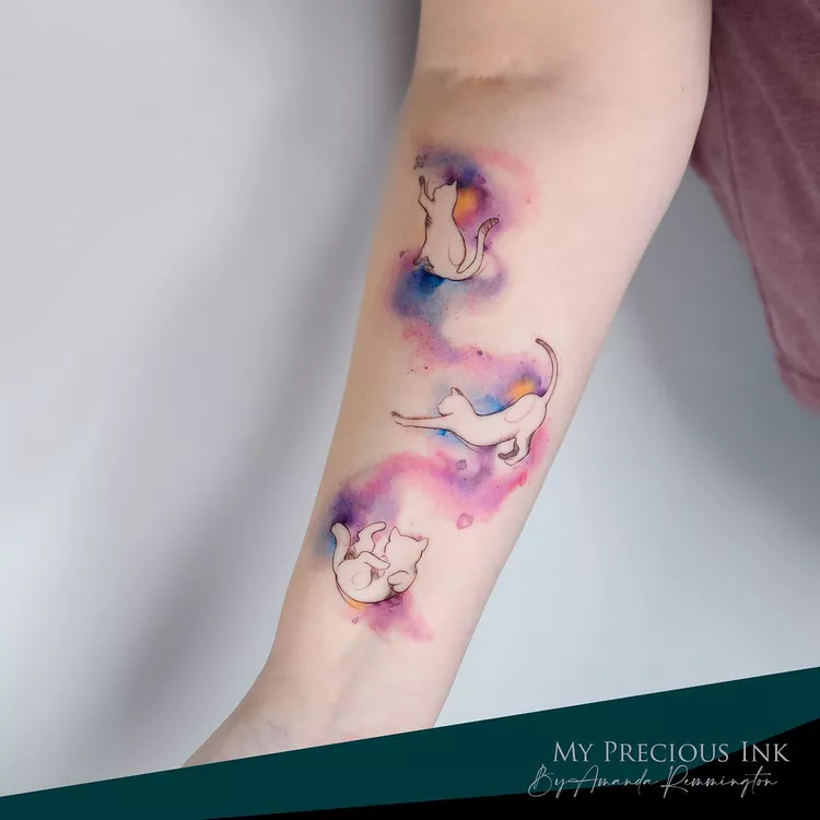
Soft edges and colour bleeds
Absence or reduction of black outline
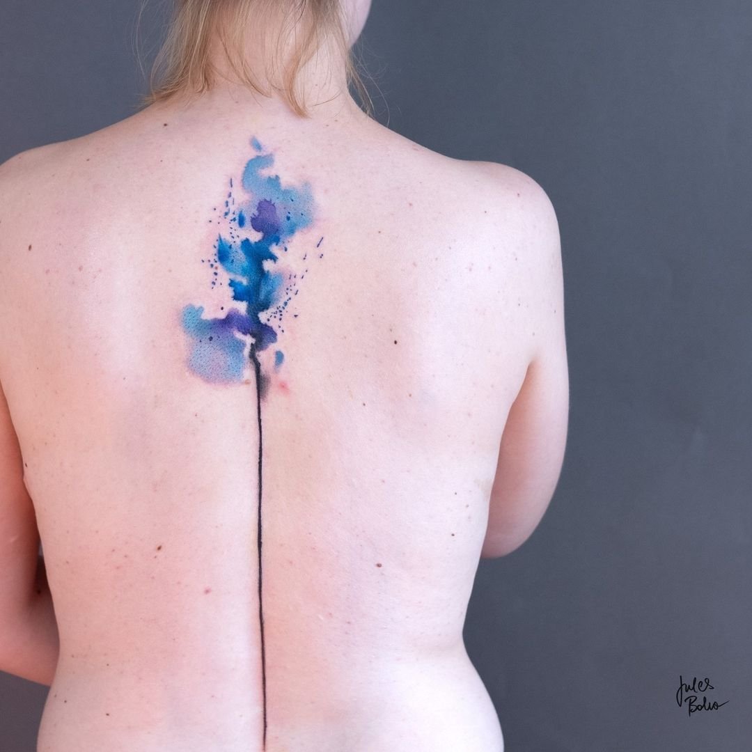
The original and most controversial characteristic. Pure watercolour work uses no black outline at all — the image is carried entirely by colour. Many contemporary watercolour artists have adopted a modified approach: a fine or partial black understructure (sometimes called a “skeleton”) beneath or within the colour, providing structural support without the visual weight of a traditional outline. This hybrid approach addresses the ageing concern while retaining the watercolour aesthetic.
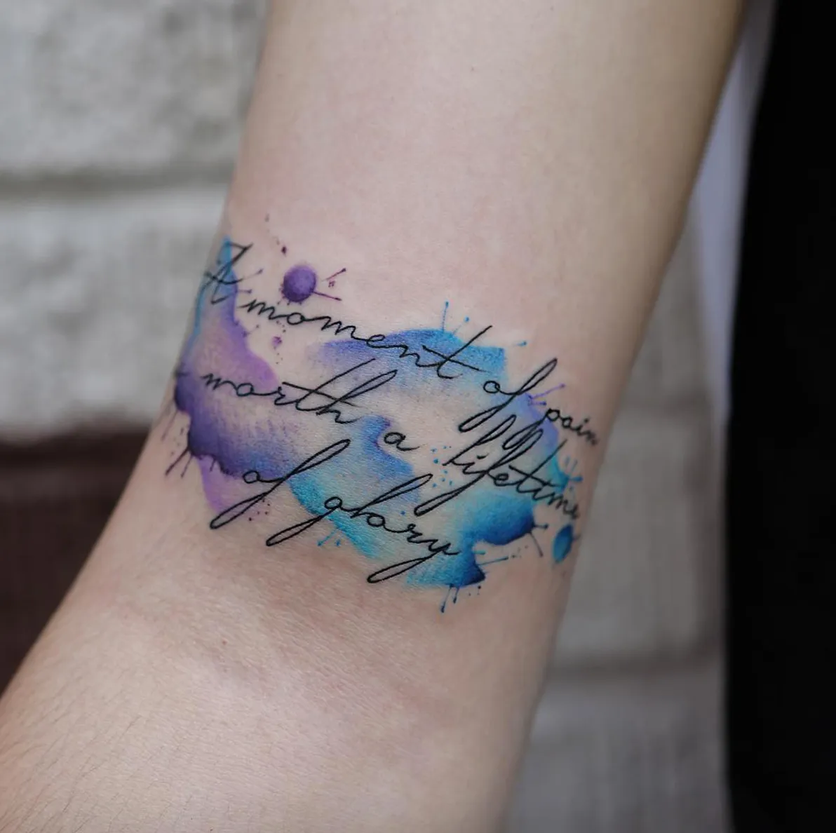
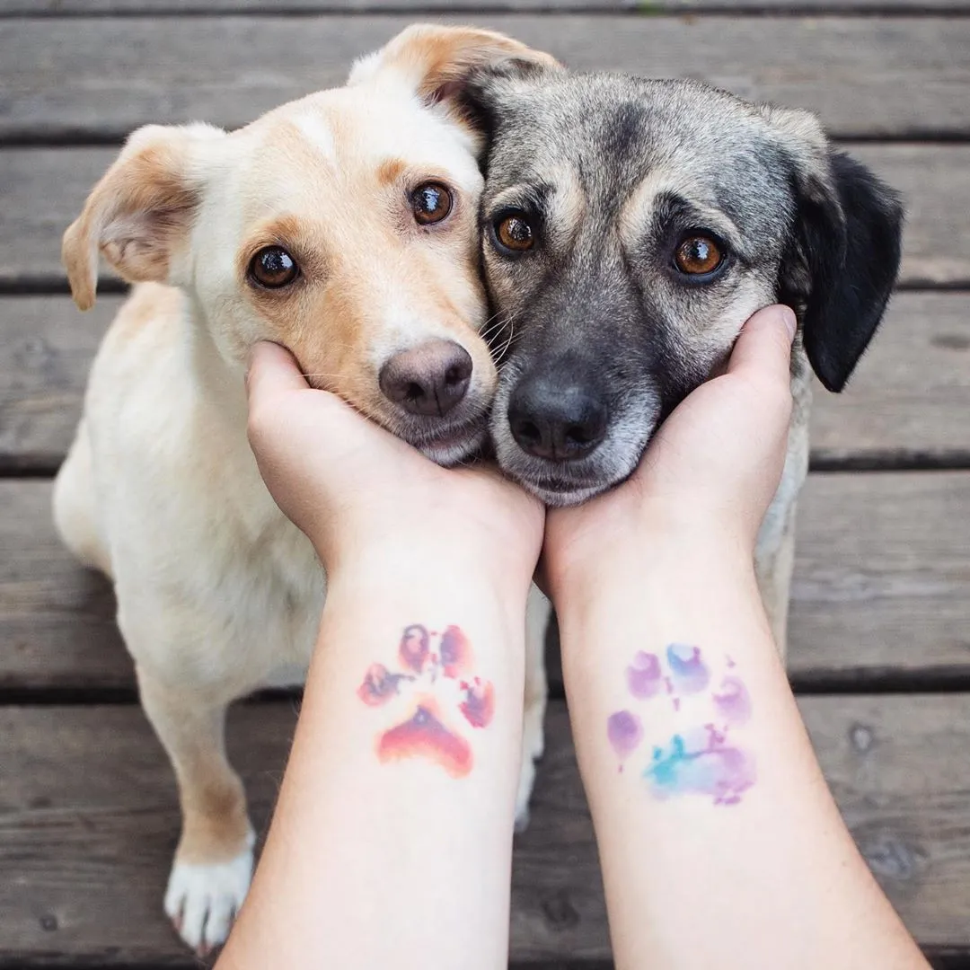
Translucent colour washes
Colours applied at reduced density, allowing the skin to show through and producing a luminous, light-filled quality that mimics the translucency of watercolour paint on paper. This is achieved through lighter ink deposits, through diluted pigments, and through spacing techniques that leave micro-areas of bare skin within the colour field.
Splatter and drip effects
Vibrant, varied palette
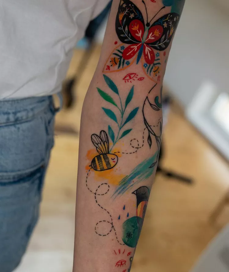
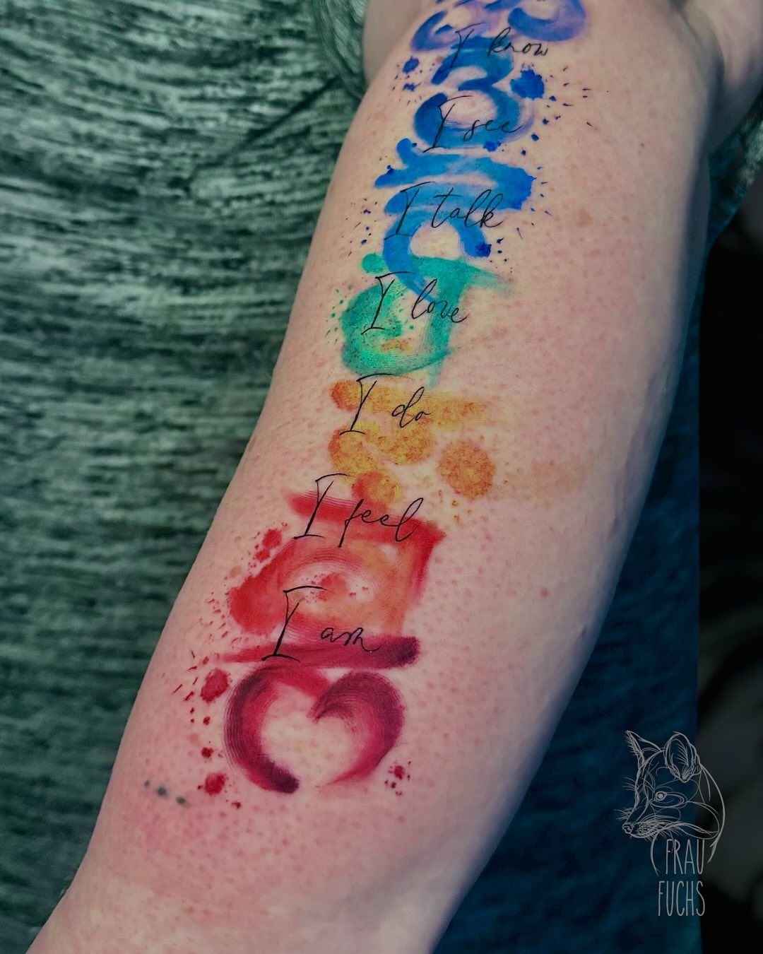
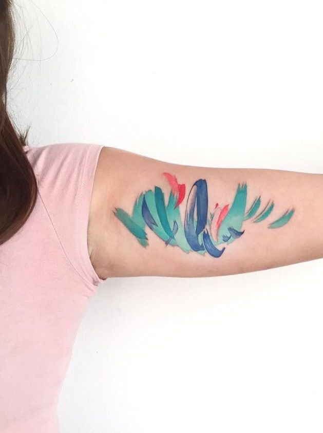
Figurative and abstract subjects
Watercolour tattoos and the ageing debate
This is the most discussed aspect of the style, and the section that most directly affects anyone considering a watercolour tattoo. The debate has two sides, and the truth sits between them.
The criticism
The defence
Where the evidence stands
The style is roughly fifteen years old in its current form. The earliest serious watercolour pieces are now reaching the age where meaningful ageing data exists. The emerging picture is consistent with what both sides have always said: execution quality is the primary determinant of ageing behaviour.
Watercolour pieces with strong structural elements — dark underwork, well-packed colour fields, strategic use of black or very dark tones to anchor the composition — age competently. The colours soften, the edges blur slightly, and the overall piece settles into a version of itself that is recognisably what it was meant to be.
Watercolour pieces without structural elements — light colour washes with no underwork, diffuse edges with no anchoring, pale tones on high-exposure body areas — age poorly. The colours fade toward invisibility, the edges blur into each other, and the image can become difficult to read within five to ten years.
The practical conclusion: watercolour tattooing works as a long-term style when the artist understands how to build structural support into a design that appears, on the surface, to be structurally free. The apparent looseness of a good watercolour tattoo conceals a considered internal structure — dark tones beneath the light, denser packing beneath the diffuse, compositional bones beneath the painterly surface.

Technical demands
Watercolour is among the most technically demanding styles in tattooing, and the demands are specific to the simulation of a different medium.
Colour theory
Watercolour tattooing requires a working knowledge of colour relationships — how colours interact when placed adjacent to each other on skin, how pigments shift as they heal, how the client’s skin tone affects the apparent colour of the ink, and how colours fade at different rates (reds faster than blues, yellows fastest of all). An artist who does not understand colour theory will produce watercolour work that looks murky, dissonant, or washed-out after healing.
Gradient and wash technique
Building a smooth gradient from saturated colour to bare skin — the effect that defines the style — requires careful management of needle depth, machine speed, and ink dilution across a continuous passage. The gradient must look smooth and effortless; achieving that smoothness requires precise, deliberate technique. Patchy gradients that heal unevenly are the most common technical failure in watercolour work.
Edge control
Splatter and drip rendering
Each simulated paint splatter is tattooed mark by mark — individual dots, flicks, and small deposits placed to create the visual effect of paint thrown or dripped. The marks must look random while being precisely placed. Actual randomness produces a mess; simulated randomness requires compositional judgment about where each mark sits.
Structural underwork
The internal structure that supports a watercolour design — the dark tones, the denser passages, the strategic black elements — must be built first and then covered or surrounded by the lighter, more diffuse colour work. The underwork is invisible in the finished piece if done well; it is what keeps the piece legible at ten years. Building effective underwork without making it visible requires planning and restraint.
Skin tone interaction
Watercolour work on light skin produces a different visual effect from the same work on darker skin, because the translucent colour washes interact with the underlying melanin. Light washes on darker skin can appear muted or muddy; saturated colours hold their identity better. A watercolour artist has to adjust their palette and their packing density for each client’s skin tone — a level of customisation that the style demands and that generalists may not anticipate.
What works on the skin
Saturated colours hold better than pale ones. A saturated teal will still be readable at ten years; a very pale lavender wash may not. Compositions that use strong colours as their primary visual content and reserve the palest washes for accent and edge effects age more reliably than compositions built entirely from the lightest tones.
Warm colours fade faster than cool colours. Reds, oranges, and yellows degrade faster than blues and greens under UV exposure. A watercolour composition with a predominantly warm palette will require more sun protection and may require touch-ups sooner than one with a predominantly cool palette.
Size matters. Watercolour effects — soft edges, gradient washes, splatters — need room. A watercolour hummingbird the size of a palm has enough space for the colour effects to read. The same design at the size of a coin will lose its watercolour quality as the edges soften and the details blur. Most experienced watercolour artists have a minimum size below which they will not attempt the style’s characteristic effects.
Placement affects longevity. Upper arm, thigh, back, chest, and ribs are the strongest placements — stable skin, moderate sun exposure, low friction. Forearms are workable but get more sun. Hands, fingers, feet, and necks are poor places for watercolour work because the combination of high exposure, thin skin, and constant friction accelerates the fading of the very elements that define the style.
Some black helps. The modified watercolour approach — colour washes anchored by fine black linework or dark underwork — ages significantly better than the pure no-outline approach. For a client who wants the watercolour aesthetic but also wants the work to hold up for decades, discussing the role of structural elements with the artist is one of the most important conversations to have before committing.
Choosing a watercolour tattoo artist
Look for colour competence across the portfolio. A strong watercolour portfolio shows control of colour — harmonious palettes, smooth gradients, colours that read cleanly against the skin tone they were applied to. A portfolio where every piece uses the same three colours, or where the healed colours look muddy, indicates limited colour understanding.
Look for healed work. The advice that applies to every style applies with particular urgency here. Fresh watercolour tattoos look stunning — the colours are at their most vivid, the edges are at their crispest, and the skin’s natural reaction to the trauma adds a flush that makes everything look more saturated. The healed result — at six months, at a year, at five years — is the real measure. Any watercolour artist who takes the style seriously will have healed photographs available and will show them willingly.
Ask about structural underwork. An artist who discusses the role of black or dark underwork in supporting a piece’s longevity demonstrates that they understand the medium. An artist who dismisses the ageing concern entirely — “watercolour tattoos age fine, don’t worry about it” — may not be thinking about the work in the time frame that matters.
Check for fine art background. Many of the strongest watercolour tattoo artists have training in painting, illustration, or fine art, and their painting skills transfer. A portfolio that shows evidence of colour theory, compositional intelligence, and an understanding of how watercolour paint behaves on paper is a positive indicator.
Expect longer sessions. Watercolour work requires careful colour layering, precise gradient construction, and deliberate edge management. The sessions tend to be longer per unit of coverage than most other styles, and the cost reflects this.
Watercolour tattoos today
Watercolour tattooing had its peak of mainstream attention in the early to mid-2010s and has since settled into a stable, if less fashionable, position. The initial surge of enthusiasm produced both excellent work and a great deal of poorly executed work — the second kind fuelling the criticism that has followed the style throughout its existence.
The style’s current practitioners are, on average, more technically accomplished than the first wave because ageing data now exists and lessons have been learned. The best watercolour artists working today understand the need for structural support, they understand colour behaviour on skin over time, and they design for the decade rather than for the photograph. The worst — artists offering watercolour as a trendy option without the specific colour and gradient skills the style requires — still produce work that will age poorly.
For a client, the situation is practical: watercolour tattooing works when done well, and “done well” means finding an artist with genuine watercolour-specific skills, discussing structural support openly, choosing a strong placement, accepting that the lightest and most diffuse elements will soften over time, and planning for possible touch-ups. A watercolour tattoo chosen with these considerations in mind can be a striking and durable piece. A watercolour tattoo chosen on impulse from an artist without the specific skills is one of the higher-risk style choices in contemporary tattooing.
Sources & further reading
- Anna Felicity Friedman, The World Atlas of Tattoo. Yale University Press, 2015.
- Matt Lodder, Painted People: Humanity in 21 Tattoos. Harper, 2024.
- Margo DeMello, Bodies of Inscription: A Cultural History of the Modern Tattoo Community. Duke University Press, 2000.
- Nick Schonberger and Rob Kingston, Forever: The New Tattoo. Gestalten, 2012.
- Jørgen Serup, Nicolas Kluger, and Wolfgang Bäumler (eds.), Tattooed Skin and Health. Current Problems in Dermatology, vol. 48, Karger, 2015.