Trash Polka
Trash Polka: A style with two inventors and a trademark
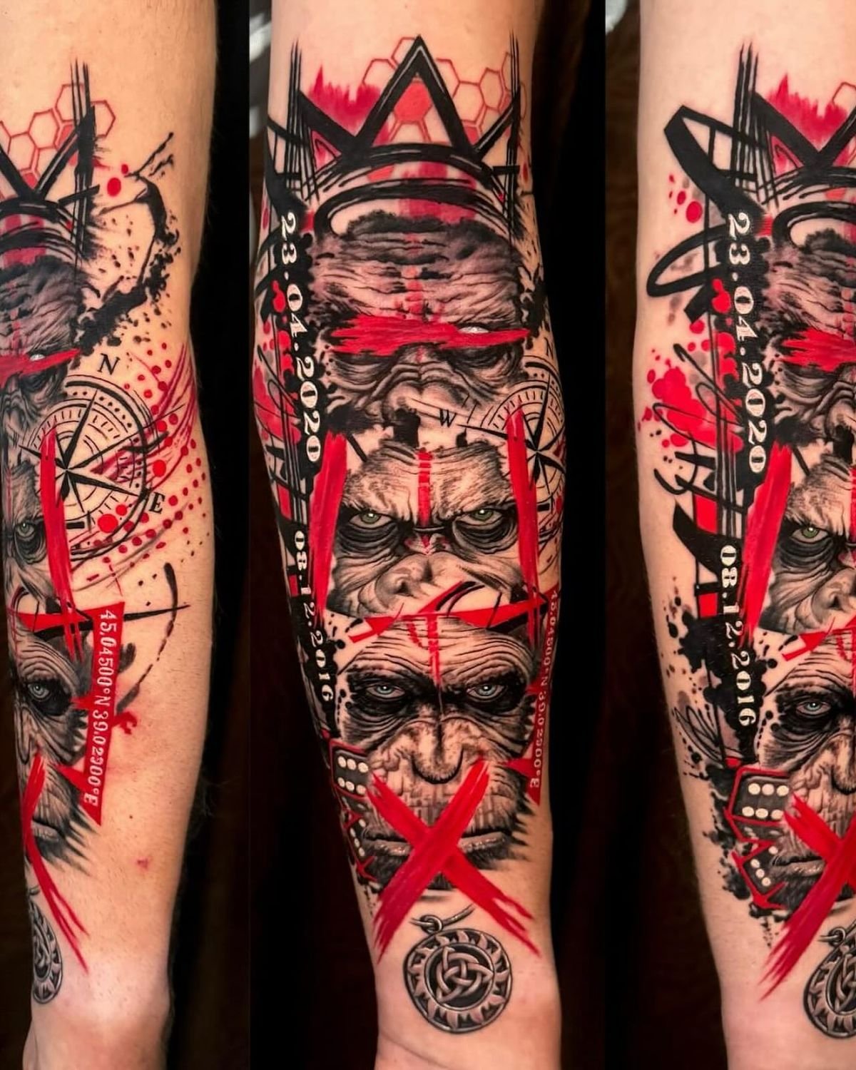
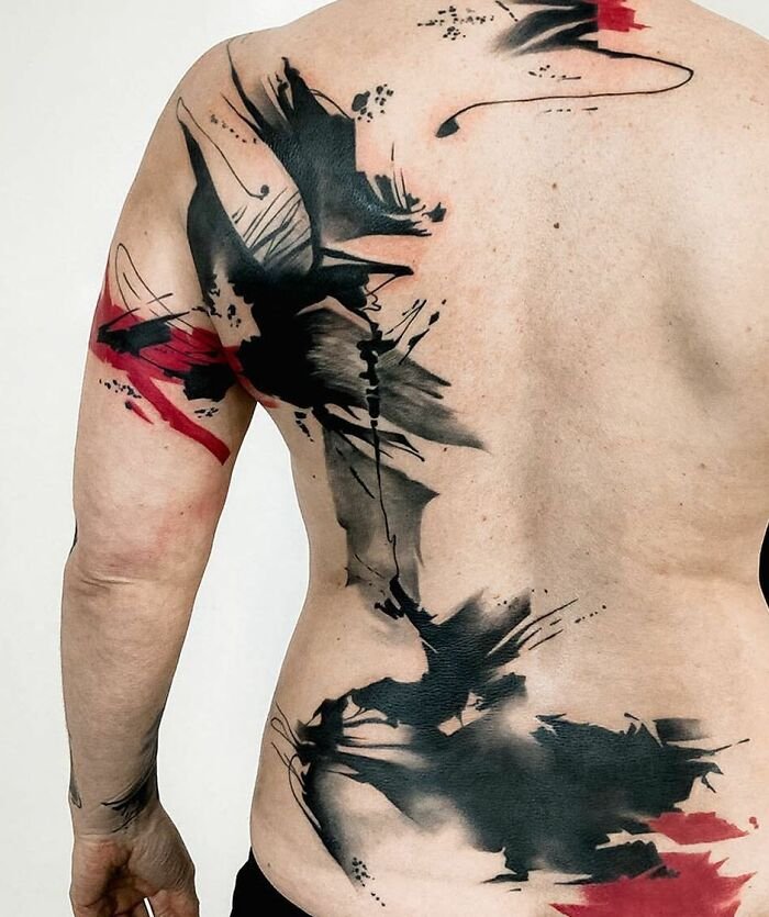
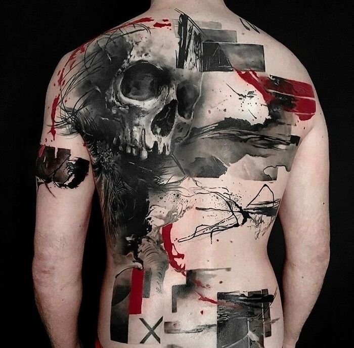
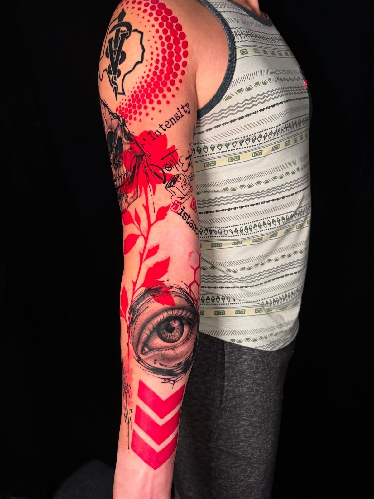
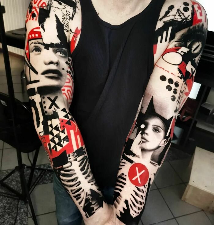
What they authored is a style that combines photorealistic rendering with graphic disruption — realistic portraits and figurative images layered with, cut through, and surrounded by abstract marks, heavy brushstrokes, geometric shapes, typographic elements, and fields of solid black and red. The result is a collage on skin: controlled realism and deliberate chaos occupying the same composition, held together by contrast and by the compositional instincts of the artists who designed the piece. The palette is restricted — primarily black and red, though other colours appear occasionally — and the scale is typically large. This is a style that demands space on the body and trust between artist and client.

Trash polka creators
This background matters because Trash Polka is a style made by people whose visual and creative references extend well beyond tattooing. The graphic design training is visible in the typographic elements and the compositional structure of the work. The painting practice is visible in the brushstroke textures and the collage layering. The musical sensibility — the idea of combining disparate elements into a composition that holds together through rhythm and contrast — is where the name comes from.
style characteristics
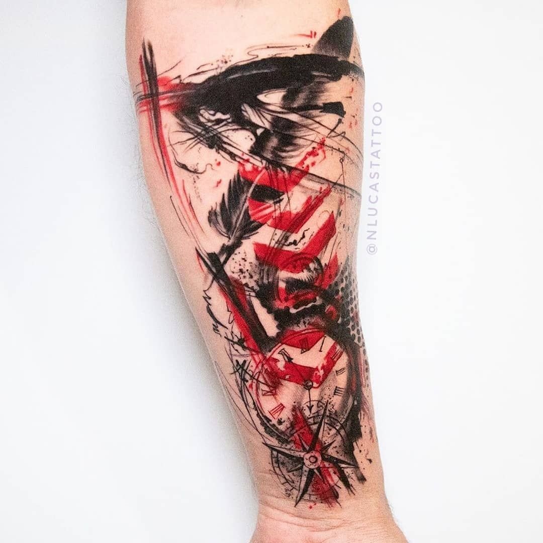
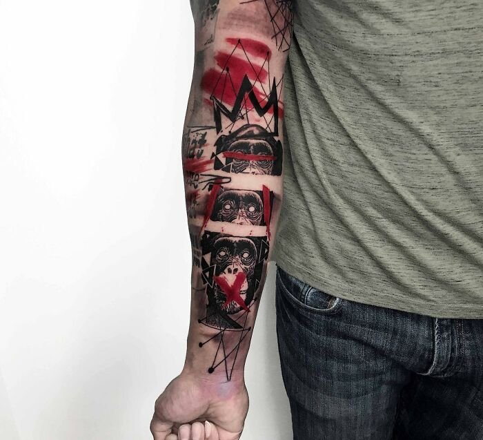
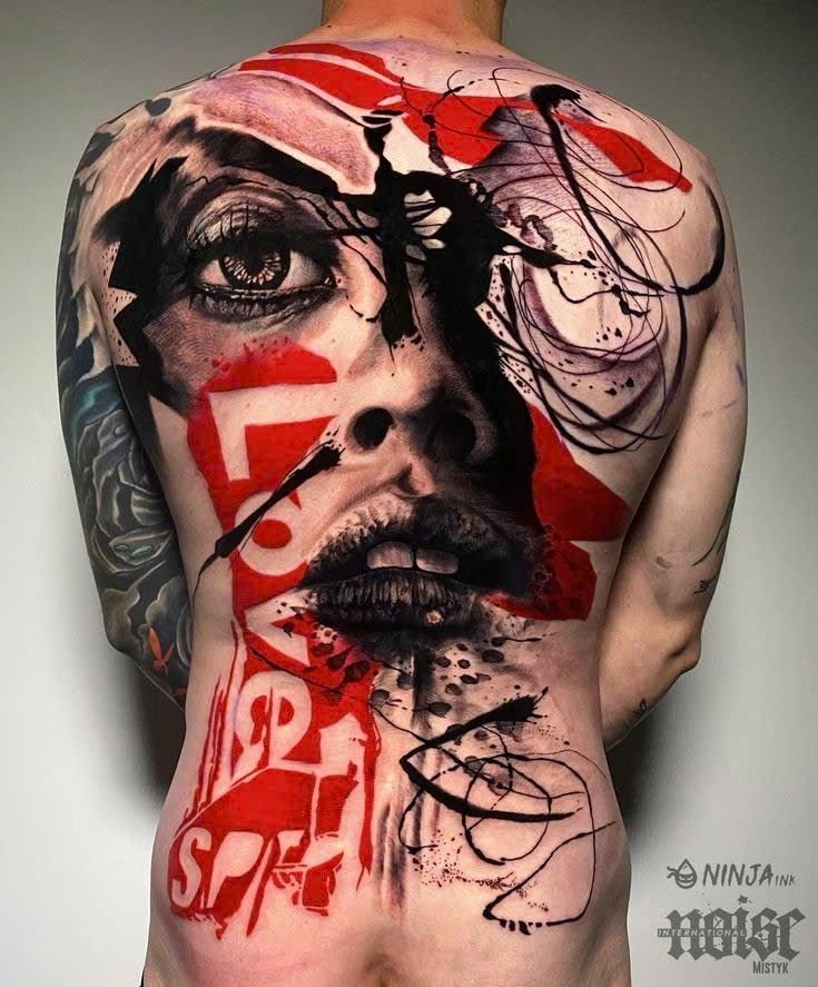
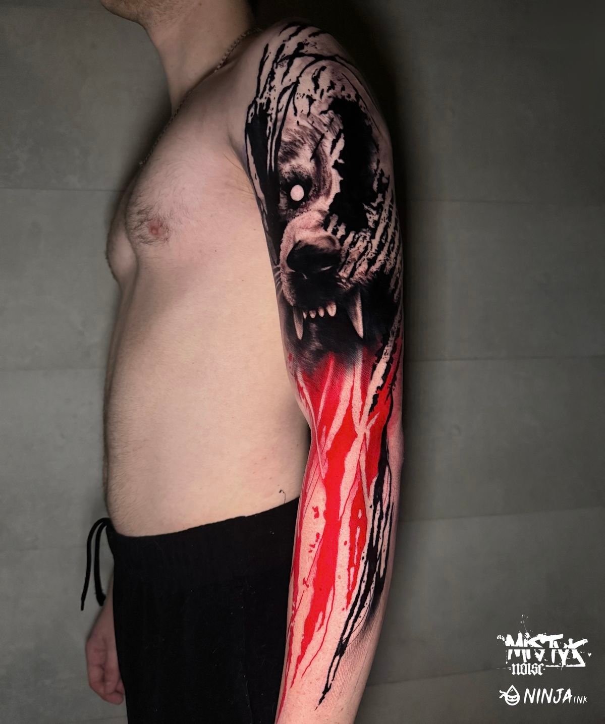
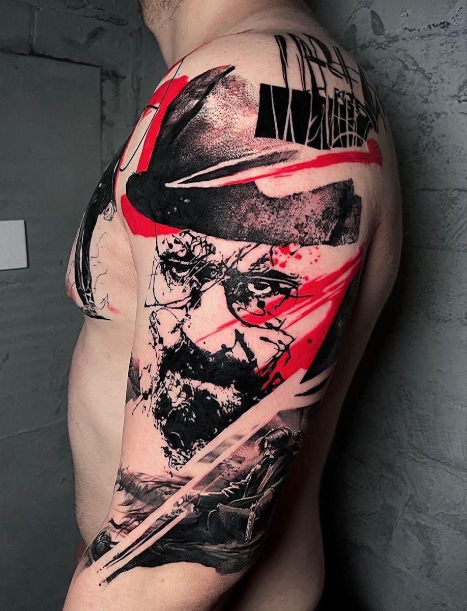
Photorealistic elements combined with graphic elements. A realistic portrait of a face layered with bold black brushstrokes. A detailed rendering of a clock mechanism cut through by geometric shapes and fragments of text. A photorealistic eye surrounded by splatters of red and fields of solid black. The combination of controlled rendering and apparent chaos is the visual signature of the style.
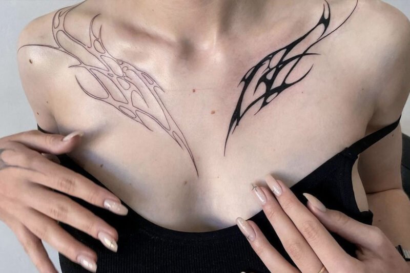
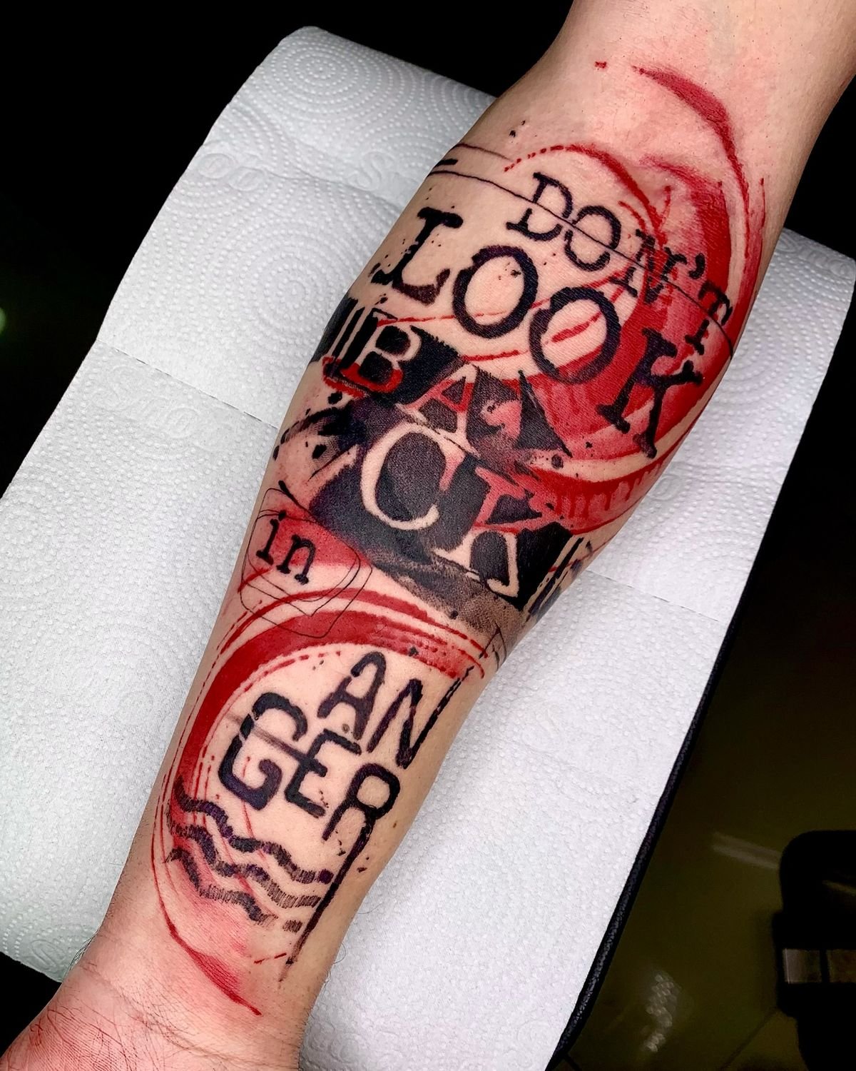
Black and red as the primary palette. The restricted colour scheme is one of the style’s most immediately recognisable features. Black provides realism, graphic weight, and structural dark values. Red provides accent, contrast, and a visual intensity that cuts across the black-and-grey rendering. The red is typically applied in splashes, smears, brushstrokes, or geometric blocks rather than as naturalistic colour within the realistic elements. Other colours appear occasionally in some practitioners’ work, but the black-and-red restriction is the convention that most defines the style’s visual identity.
Brushstroke and splatter textures. Many Trash Polka compositions include marks that look as if they were made with a loaded brush dragged across the skin, or as if ink were splattered or dripped. These are tattooed renderings of painted or printed marks — the artist is tattooing the image of a brushstroke, not actually painting with a brush. The effect simulates mixed media on the body: the precision of a photograph layered with the energy of a painting.
Typographic and calligraphic elements. Words, phrases, text fragments, numbers, coordinates, or abstract letterforms frequently appear in the compositions. The text may be drawn from song lyrics, poetry, personal statements, or purely graphic letterforms used for visual texture. Font choices range from typewriter text to bold display type to handwritten script. The text functions as both content (meaning) and form (visual pattern) within the composition.
Large geometric or abstract shapes. Circles, lines, triangles, or irregular shapes — often in solid black or solid red — are placed across or within the realistic elements. These shapes disrupt the reading of the realistic image and create a compositional structure that holds the disparate elements together.
Large scale. Trash Polka compositions are typically large — full sleeves, half-sleeves, chest panels, full back pieces, or large thigh pieces. The style needs room for its layered elements to be individually readable while contributing to the overall composition. Small-scale Trash Polka is rare and usually less effective because the graphic disruption elements compete with the realistic elements for space.
The compositional method
Merschky and Pfaff’s working process, as they have described it in interviews, starts with a conversation. The client brings a thematic idea — a subject, a set of images they respond to, keywords from a song, poem or personal experience. Merschky and Pfaff then design the piece digitally, creating two or three compositions that work with the theme, the client’s body, and the style’s visual language. The client sees the designs, and a final version is agreed on.
This process is collaborative but artist-led. Merschky has said:
“If we only did what people want, we would never have been able to develop anything new.”
The statement captures a specific philosophy about the artist-client relationship in Trash Polka — the client provides the raw material (the theme, the personal meaning, the emotional content), and the artists provide the compositional intelligence that turns that material into a design.
This working method has implications for anyone seeking work with Trash Polka. The style does not suit clients who arrive with a finished design and ask for exact execution. The compositional decisions — where the realism sits, where the graphic elements cut through, how the text interacts with the imagery, how the red is placed — are design decisions that require the artist’s creative input. A Trash Polka piece designed entirely by the client and executed by an artist as a technical service will usually lack the compositional tension that defines the style at its best.
What separates Trash Polka from adjacent styles
Graphic tattooing. A broader category that includes any tattoo work using bold graphic elements — geometric shapes, abstract compositions, typographic elements, high-contrast black-and-red or black-and-white palettes. Trash Polka is a specific style within graphic tattooing, distinguished by its combination of photorealistic rendering with graphic disruption and by its collage-like compositional method. A geometric abstract composition without realistic elements is graphic tattooing, but not Trash Polka.
Realism with abstract elements. Some realist artists incorporate abstract backgrounds, splashes, or geometric frames around realistic subjects. This overlaps with Trash Polka aesthetically, but the compositional relationship is different. In realism-with-abstract-elements, the realism is the primary image, and the abstract elements are supporting or framing. In Trash Polka, the two layers are meant to be co-equal — the “trash” is as compositionally important as the “realistic,” and neither is background for the other.
Watercolour tattooing. Uses colour splashes and fluid textures, but in a wider colour range and without the graphic-disruption philosophy. Watercolour work simulates the behaviour of wet pigment on paper; Trash Polka simulates the layering of collage and mixed media.
Graphic tattooing. A broader category that includes any tattoo work using bold graphic elements — geometric shapes, abstract compositions, typographic elements, high-contrast black-and-red or black-and-white palettes. Trash Polka is a specific style within graphic tattooing, distinguished by its combination of photorealistic rendering with graphic disruption and by its collage-like compositional method. A geometric abstract composition without realistic elements is graphic tattooing, but not Trash Polka.
Photomontage and collage tattoos. A broader category of tattoo work that uses collage-like composition. Trash Polka is the most codified and named version of this approach. Still, other artists work in collage idioms without using the Trash Polka palette or the specific combination of realism and graphic disruption.
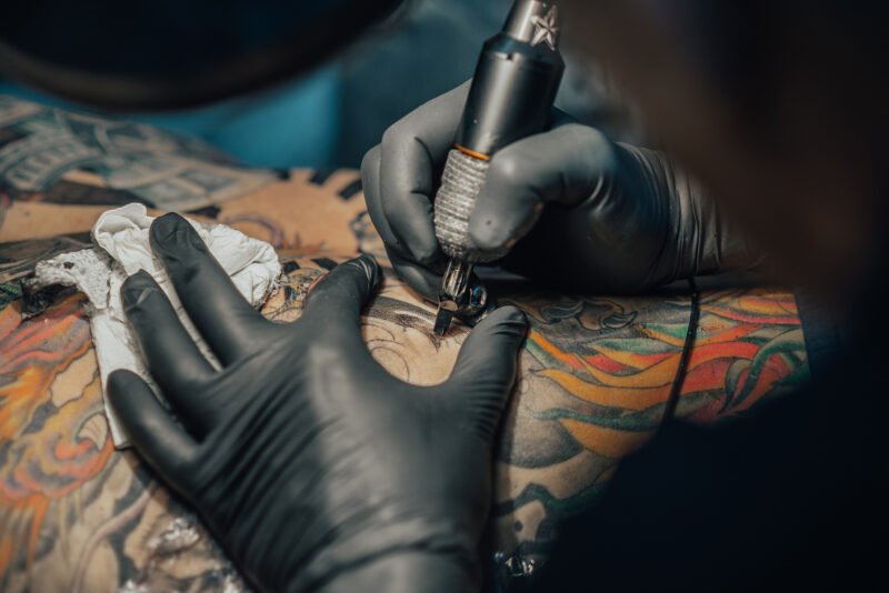
Technical demands
Realism skills. The photorealistic elements require the same value control, edge management, and depth consistency that any black-and-grey realism demands. A portrait within a Trash Polka composition has to be as technically accomplished as a standalone realism portrait, because the graphic elements surrounding it amplify rather than conceal any weakness in the rendering.
Graphic execution. The brushstrokes, splatters, and geometric shapes have to look convincing. A tattooed brushstroke that fails to capture the energy and texture of an actual one reads as a grey smear. A tattooed splatter that is too regular looks mechanical. These elements require the artist to understand how the simulated media (paint, ink, charcoal) actually behave and to reproduce that behaviour with a tattoo machine, which deposits ink in a fundamentally different way.
Compositional integration. The hardest part of Trash Polka is making the disparate elements work together on the skin. The realistic and graphic elements must be placed so that the eye moves between them in a rhythm that reads as intentional. Too much realism and the graphic elements look like damage; too much graphic disruption and the realism disappears; wrong placement of either and the composition falls apart. This is a design skill that goes beyond the technical execution of any single element.
Red ink management. Red tattoo pigment is more prone to allergic reactions than black, fades faster than black, and shifts tone more over time than black. The red elements in Trash Polka are often large — solid fields, broad brushstrokes — and they need to be packed evenly and at sufficient density to hold their saturation. Under-packed red that heals patchily is a common failure point in less experienced Trash Polka work.
Ageing
The ageing behaviour of Trash Polka is mixed because the style combines elements with different longevity profiles.
The solid black elements — dense fills, bold geometric shapes, heavy lines — are the most stable components. Carbon black is chemically inert and UV-resistant. These elements will hold their form for decades.
The photorealistic elements will age the way all black-and-grey realism ages: the tonal detail will soften, the edges will blur slightly, and the finest value transitions will flatten. A realistic portrait within a Trash Polka composition will be less photographic at fifteen years than it was at one year. The graphic context around the portrait — the brushstrokes, the splatters, the text — provides a visual framework that compensates for some of this softening. A slightly softened portrait inside a Trash Polka composition reads better than the same portrait standing alone, because the surrounding graphic elements provide structural context that the eye uses to hold the image together.
The red elements are the most vulnerable. Red pigment fades faster than black, and the large red fields in Trash Polka work can shift in saturation and tone over time. The intensity of the black-red contrast — one of the style’s defining visual features — will diminish as the red settles. Touch-ups of the red elements are common after five to ten years.
The trademark and its implications
Trash Polka is a registered trademark of Volko Merschky and Simone Pfaff. This is an unusual situation in tattooing, where most style names are descriptive terms in common use. The trademark means that, strictly speaking, only Merschky and Pfaff can call their work Trash Polka. In practice, the term is used widely by artists and clients to describe work done in the style by anyone, and the trademark has not been aggressively enforced against other practitioners.
The situation creates an ambiguity. When a client asks for a “Trash Polka tattoo,” they may mean they want to go to Würzburg and be tattooed by the creators of the style, or they may mean they want any tattoo done in the visual idiom that Merschky and Pfaff developed. The distinction matters because the quality of Trash Polka work by the originators is very different from the average quality of work done in the style by other artists. The compositional method — the artist-led design process, the integration of disparate elements, the rhythmic relationship between realism and graphic disruption — is hard to replicate without the design sensibility that produced it.
Many artists working in the style use alternative terms: “graphic realism,” “abstract realism,” “collage style,” or simply describe the visual elements they work with. This sidesteps the trademark issue while still communicating what the work looks like.
Choosing a Trash Polka artist
If you are looking for an artist working in the Trash Polka idiom elsewhere, the selection criteria are specific.
Check for both realism skills and graphic composition skills. Many artists can do one but not the other. A strong portfolio in this style will show realistic elements that hold up at close inspection and graphic elements that have genuine visual energy — brushstrokes that look like brushstrokes. These splatters look like splatters, compositions that hold together as a whole.
Look at the composition, not just the components. The test of a good Trash Polka piece is whether the realistic and graphic elements feel like they belong in the same image, whether the eye moves between them naturally. A composition where the graphic elements look pasted onto a realism piece, or where the realism looks dropped into a random pattern, has failed at the compositional level, even if the individual elements are technically competent.
Look at healed work, as always. Fresh Trash Polka looks striking because the contrast between black, red, and skin is at its maximum. The healed result — particularly the behaviour of the red and the softening of the realism — is the real test.
Ask about the design process. An artist who wants to design the composition collaboratively — who asks for themes and references rather than expecting a finished design from the client — is more likely to produce work in the spirit of the style than an artist who will execute whatever is presented to them.
Museum and exhibition history
Merschky and Pfaff’s work has been exhibited in institutional contexts that most tattoo artists do not reach:
- Somerset House, London — Time: Tattoo Art Today, 2014.
- Museum of Art and Business, Hamburg, 2015.
- Art gallery, Fürth, 2015.
- Academy of Würzburg/Schweinfurt, Faculty of Design — Trash Polka, 2014.
- Museum of Contemporary Art, Rome — Tattoo Forever, 2016.
These exhibitions positioned Trash Polka within the broader contemporary art conversation and contributed to the style’s international recognition beyond the tattoo community.
Trash Polka today
The risk the style faces is the same risk any widely adopted style faces: the compositional intelligence that made the original work powerful is the hardest element to transmit. Many artists working in the visual idiom of Trash Polka can execute the individual components — a competent portrait, a bold red brushstroke, some text in a display font — without achieving the compositional integration that gives the originals their force. The style is easy to approximate but difficult to do well, and the gap between the approximate and the genuine is visible to anyone who has studied the originals.
For a client, the practical situation is clear. If the style appeals, the best available option is the original studio in Würzburg. If that is not feasible, finding an artist who works in the idiom with strong skills in both realism and graphic composition — and who approaches the design process as a collaboration rather than an execution service — is the path to a piece that honours what the style was made to do.
Sources & further reading
- Trash Polka Wikipedia entry. Available at www.en.wikipedia.org/wiki/Trash_polka.
- Buena Vista Tattoo Club official website www.trashpolka.com, and Instagram accounts: @buenavistatattooclub and @trashpolkaoriginal.
- Anna Felicity Friedman, The World Atlas of Tattoo. Yale University Press, 2015.
- Matt Lodder, Painted People: Humanity in 21 Tattoos. Harper, 2024.
- Nick Schonberger and Rob Kingston, Forever: The New Tattoo. Gestalten, 2012.
- Somerset House, London, exhibition catalogue: Time: Tattoo Art Today. 2014.
- Museum of Contemporary Art, Rome, exhibition: Tattoo Forever. 2016.
- Margo DeMello, Bodies of Inscription: A Cultural History of the Modern Tattoo Community. Duke University Press, 2000.