
Illustrative
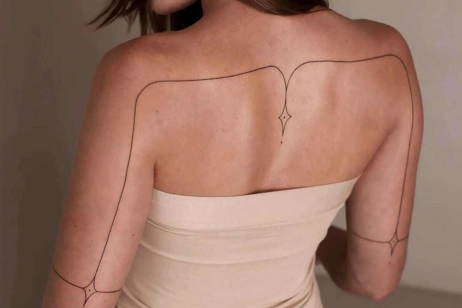
Tattooing that keeps the drawing visible
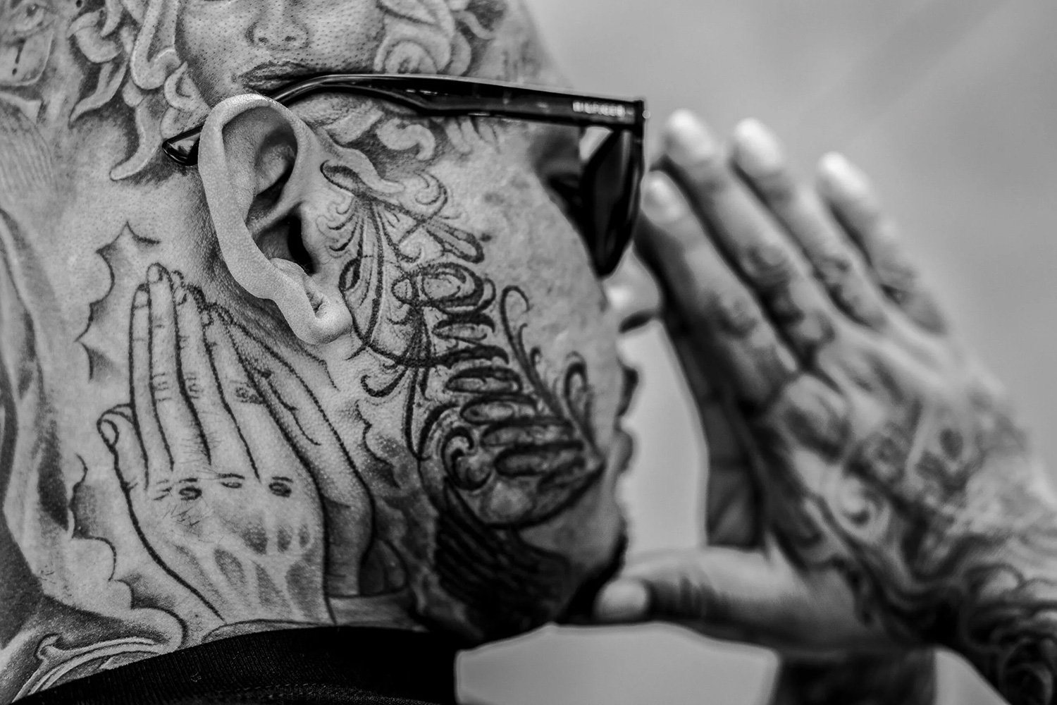
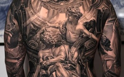
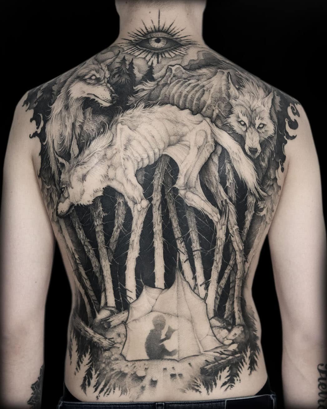
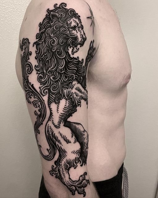
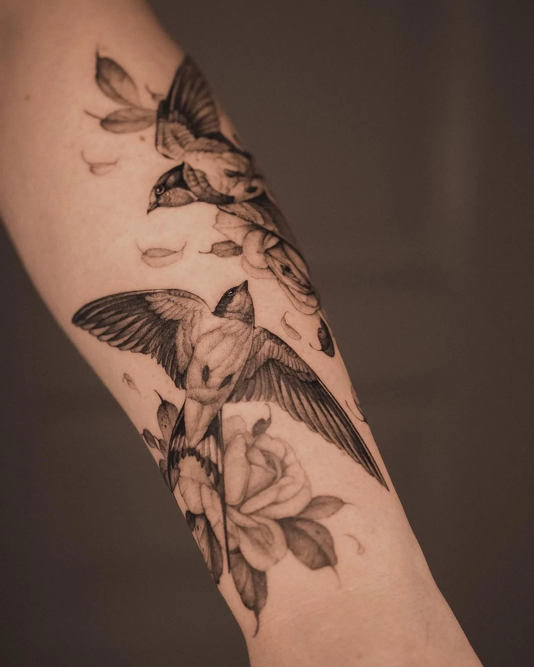
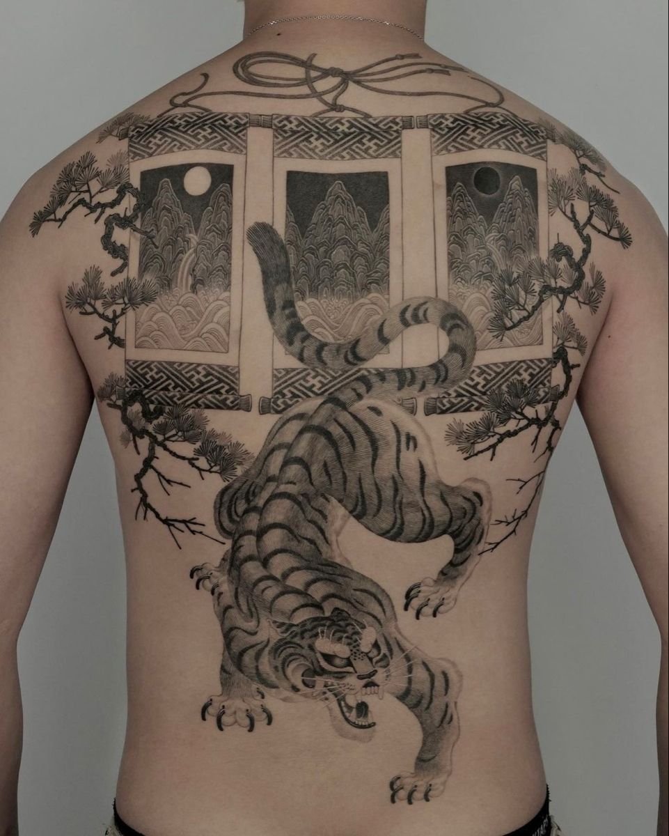
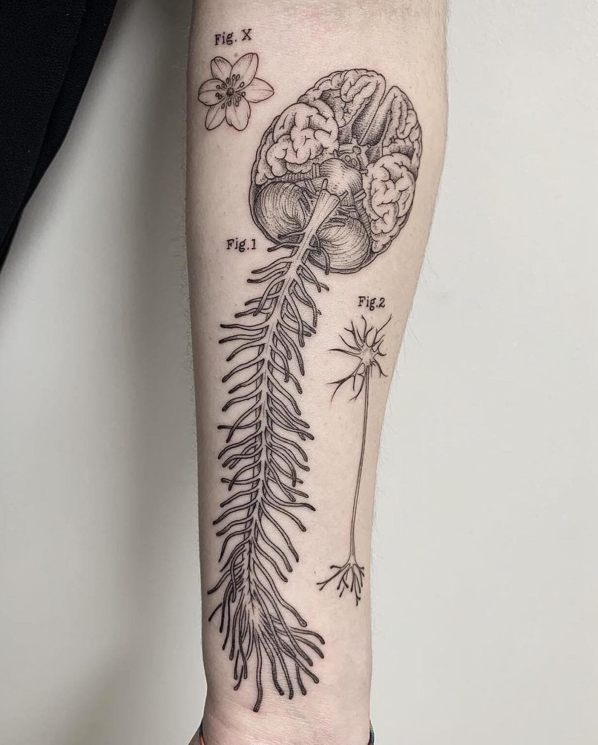
A fox curled in a thicket of ferns, rendered in fine ink lines with cross-hatched shadows, looking like it was lifted from a Victorian natural history plate. A human heart drawn with anatomical precision and surrounded by wildflowers, as though pulled from a medical textbook and placed in a garden. A full sleeve of interlocking figures, creatures, and landscapes composed like the margins of a medieval manuscript. These are illustrative tattoos, and the term describes exactly what they look like: illustrations on skin.
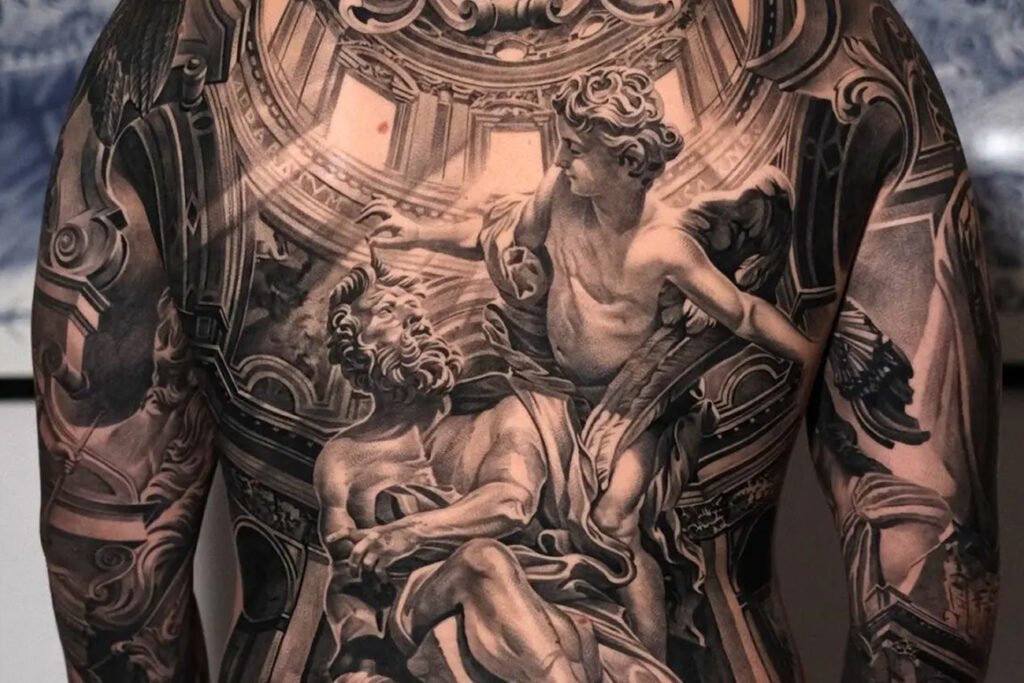
Illustrative tattooing is the style that draws most directly from traditions outside tattooing — from book illustration, from printmaking, from pen-and-ink drawing, from etching, woodcut, engraving, and lithography. Where American traditional draws from flash sheets and Japanese irezumi draws from ukiyo-e and painted scrolls, illustrative work draws from the printed page. The visual references are specific: Arthur Rackham’s fairy tale illustrations, Albrecht Dürer’s engravings, Gustave Doré’s biblical plates, Ernst Haeckel’s biological prints, the anatomical drawings of Andreas Vesalius, the botanical plates of Pierre-Joseph Redouté, the pen-and-ink work of Aubrey Beardsley, and the etchings of Rembrandt. These are the sources, and the style looks the way it does because it is trying to produce, on skin, the same qualities those sources produce on paper.
This is the style’s strength and its central problem. Paper and skin are different media. Ink on paper stays where you put it; ink in the dermis migrates. Paper does not stretch, swell, scar, or tan. A technique optimised for the printed page — fine cross-hatching, delicate stipple, hairline contours — does not automatically translate to a medium that blurs over decades. Understanding what the illustrative style does well, where it struggles, and how the best artists manage the tension between the page and the body is what this article covers.
What makes a tattoo illustrative
The style has a set of consistent characteristics, though its boundaries with fine line, blackwork, and neo-traditional are not always sharp.
The line carries the image.
In illustrative work, the drawn line is the primary visual element. Outlines, contour lines, hatching lines, and detail lines are all visible as lines — the viewer sees the drawing, not a filled shape. This is the fundamental difference from styles like realism (where line is subordinate to tonal rendering) and traditional (where line is a bold boundary containing flat colour). An illustrative tattoo looks drawn because the drawing is the point.
Shading is built from mark-making.
The visual reference is to print, not to photography.
Colour is optional and often restrained.
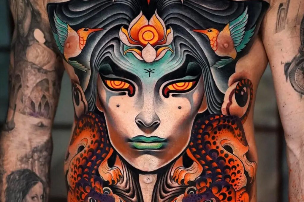
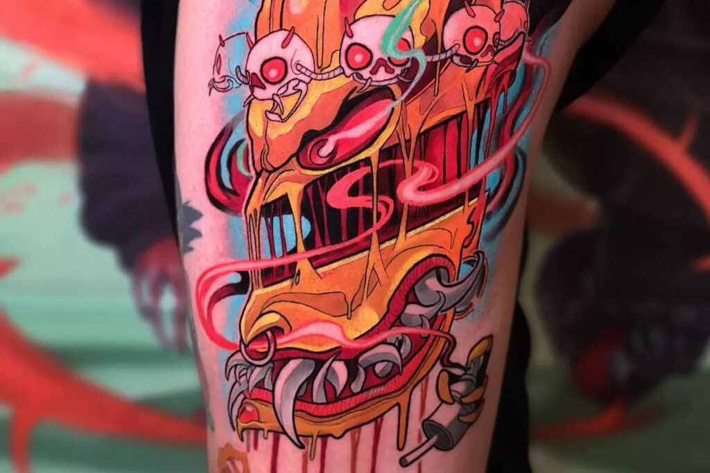
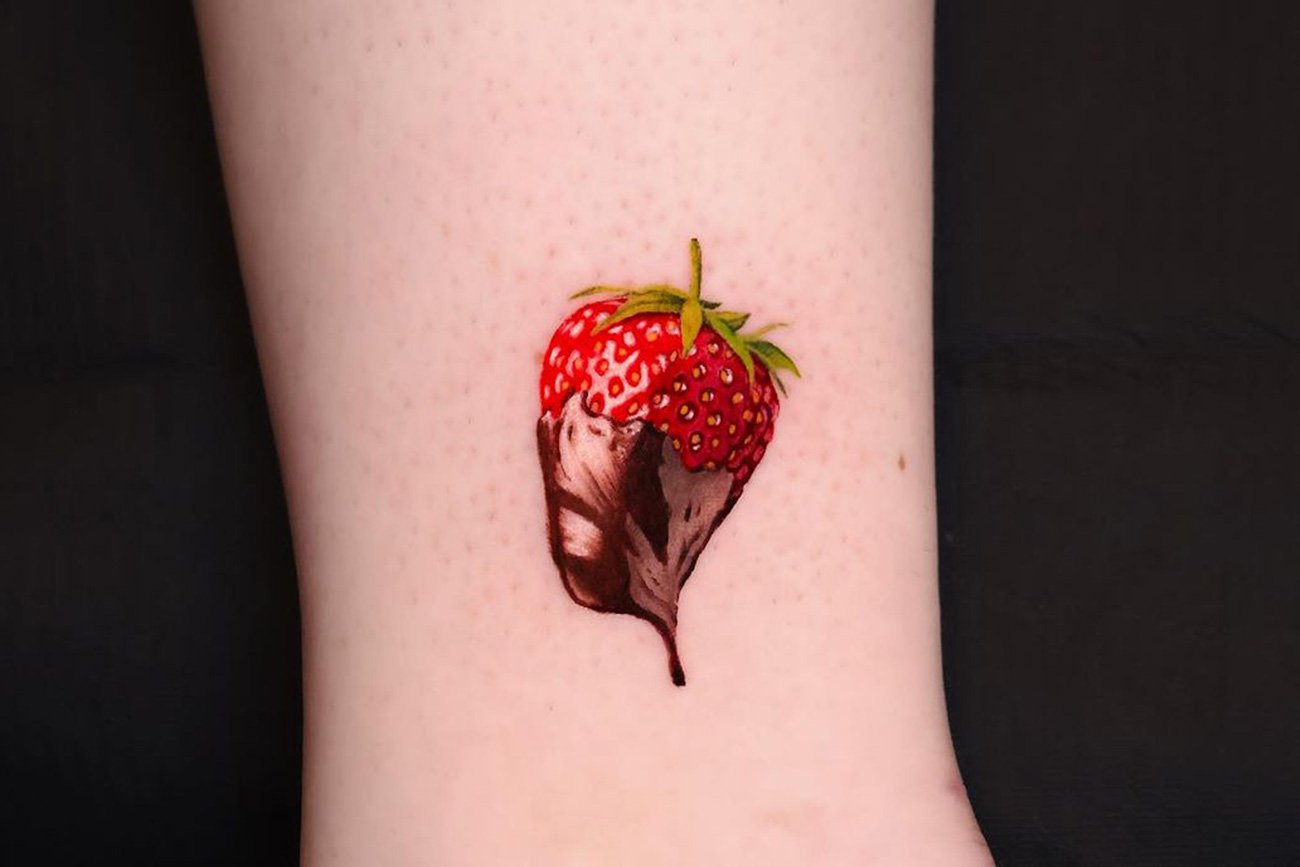
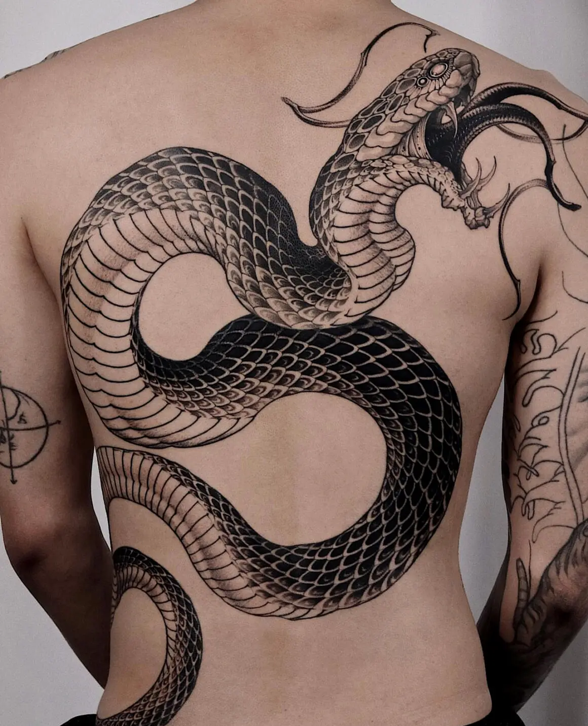
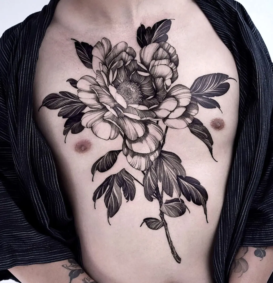
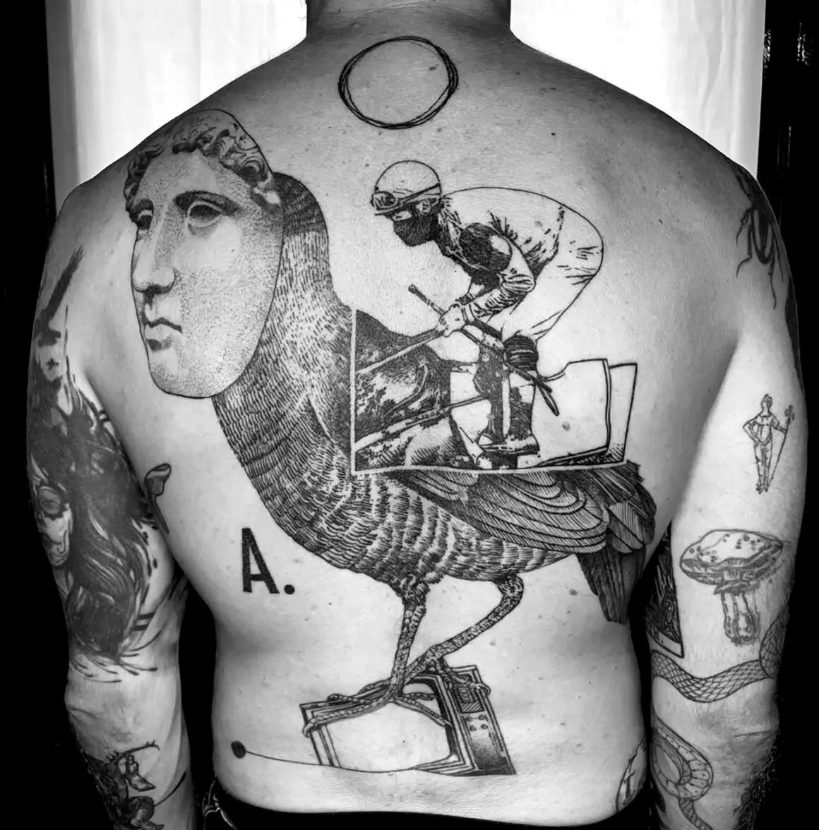
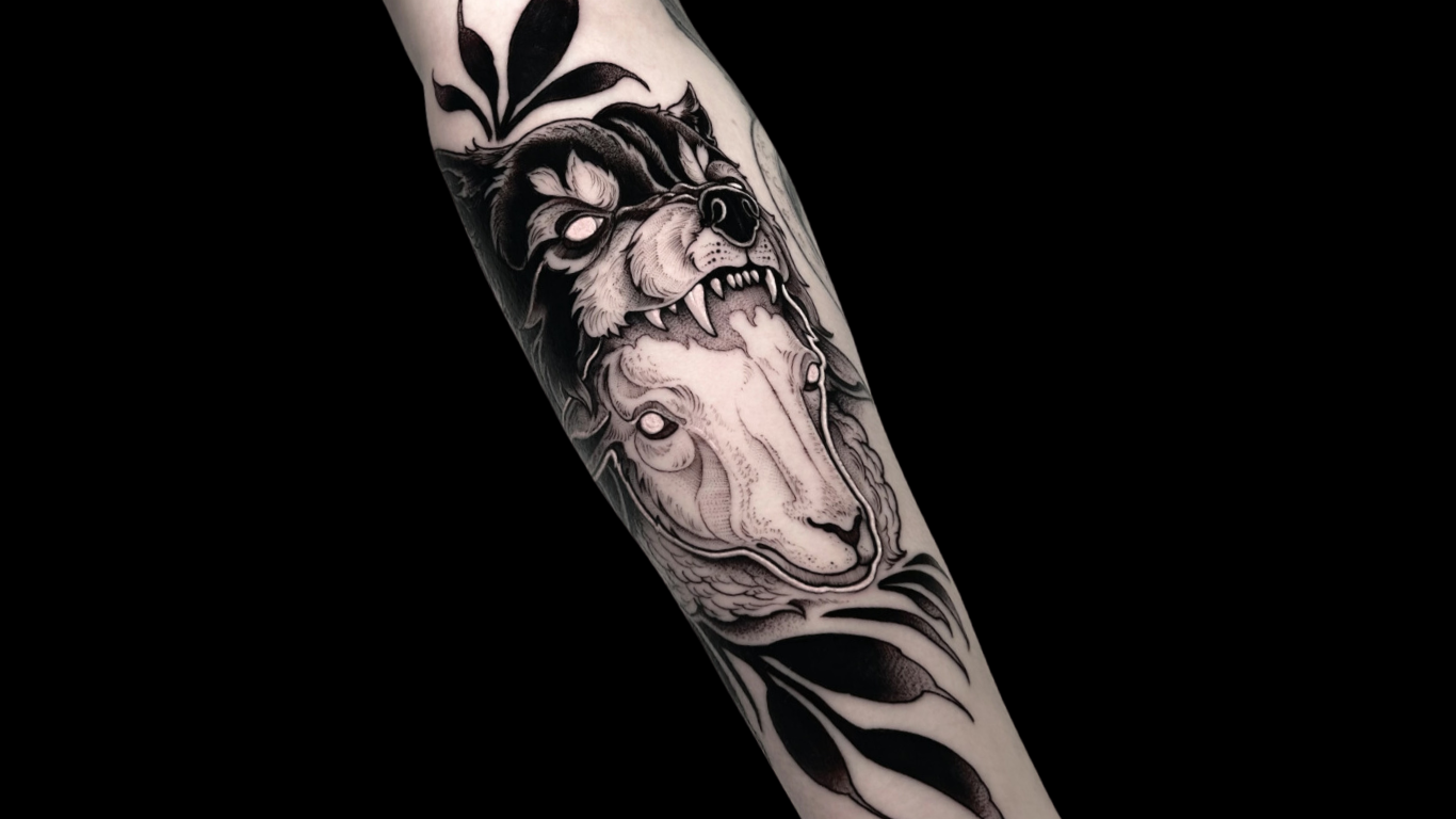
Subject matter is wide but tends toward the narrative and the natural.
Where it comes from
Illustrative tattooing does not have a single origin point or a founding generation, the way American traditional has Sailor Jerry or Chicano has Good Time Charlie’s. It emerged gradually from the work of artists who brought drawing and printmaking skills into tattooing and chose to let those skills remain visible in the finished work, making tattoos that looked like drawings on purpose.
Several developments converged.
1. The broadening of the tattoo artist base
From the 1990s onward, increasing numbers of people with formal art training — fine art degrees, illustration degrees, printmaking backgrounds — entered tattooing. Earlier generations of tattooers had mostly learned through apprenticeship in the trade; the newer generation often arrived with drawing skills developed outside the trade. These artists brought visual references and technical habits from their training, and the illustrative style is partly the result of applying those references and habits to skin.
2. The influence of specific illustration traditions
The golden age of book illustration (roughly 1880–1930, spanning Rackham, Dulac, Nielsen, Beardsley, Clarke, and others) produced a body of work that has been continuously in print and continuously influential. The natural history illustration tradition (Haeckel, Audubon, Redouté, the anonymous botanical and zoological plate-makers of the eighteenth and nineteenth centuries) produced another. Medical and anatomical illustrations (Vesalius, Grey’s Anatomy plates, Netter) produced a third. Each of these traditions offered a visual vocabulary built on the drawn line, and each has been imported into tattooing by artists who studied and admired the originals.
3. The printmaking connection
Etching, engraving, woodcut, and linocut are all techniques that produce images from lines and marks cut or drawn on a surface. The visual qualities of these media — the precision of an engraved line, the rough texture of a woodcut, the tonal range of an etching — translate well to tattooing because both the print and the tattoo are fundamentally linear media. An etched line on a copper plate and a tattooed line on skin are made by different tools but share a family resemblance, and many illustrative tattoo artists explicitly reference printmaking in their work.
4. The fine art tattoo crossover
Through the 2000s and 2010s, the boundary between tattooing and the broader art world became more porous. Tattoo artists exhibited in galleries; fine artists got tattooed or took up tattooing; and the idea that a tattoo could be a work of art in the same sense as a print or a drawing gained traction. The illustrative style benefited from this crossover because it is the tattoo style that most closely resembles the work exhibited in galleries and published in art books.
5. Social media and the portfolio economy
Instagram, which became the dominant portfolio platform for tattoo artists from roughly 2013 onward, rewarded visually distinctive work that read well as a single image on a phone screen. Illustrative tattoos — with their strong graphic quality, their visible mark-making, and their compositional completeness — performed well on the platform. The visibility fed demand, which in turn fed the style’s growth.
Branches of the illustrative tattoo style

Botanical illustration

Natural history and scientific illustration

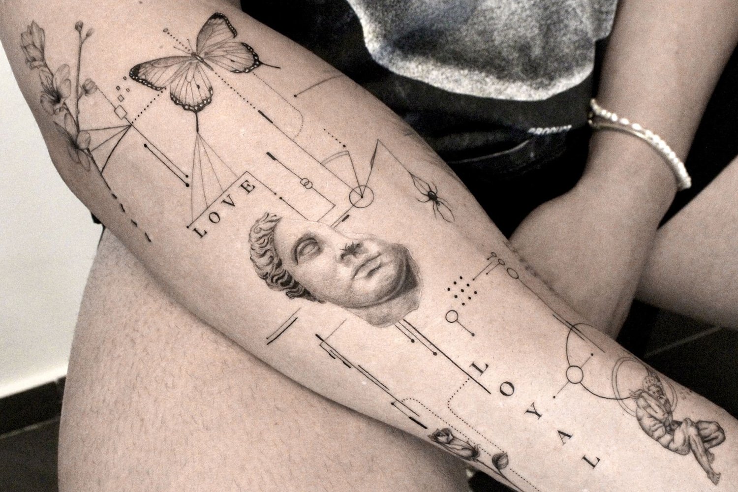
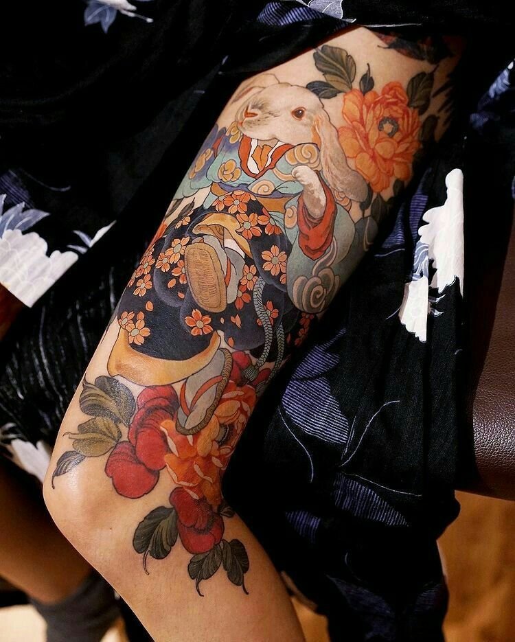
Literary and narrative illustration

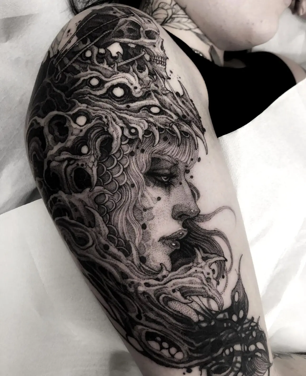
Dark illustrative

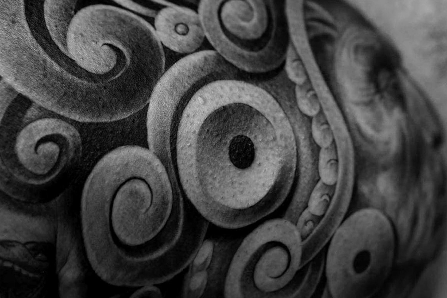
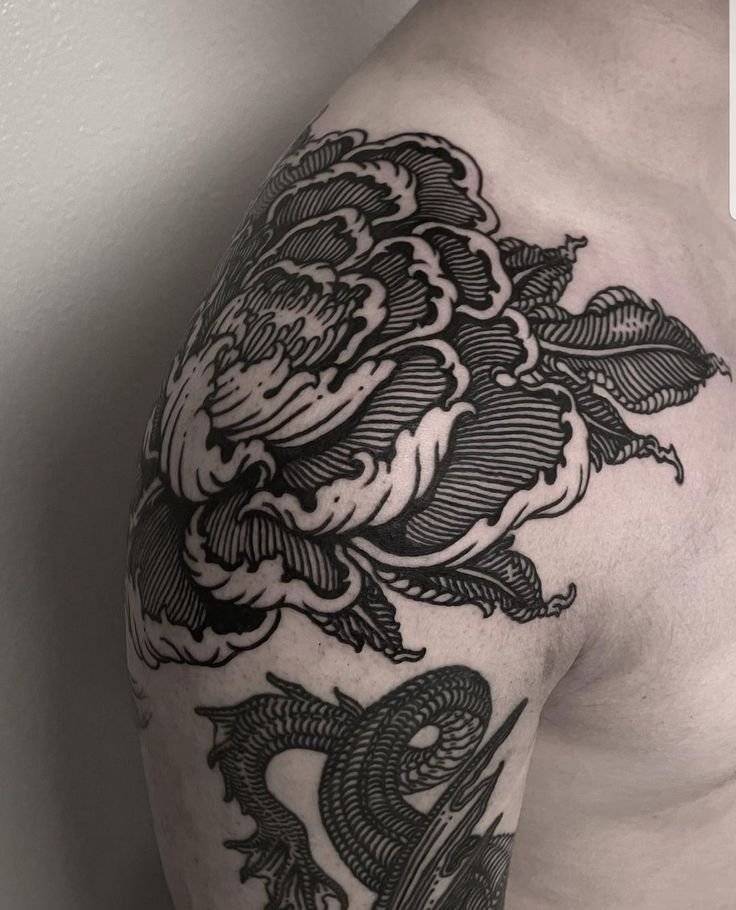
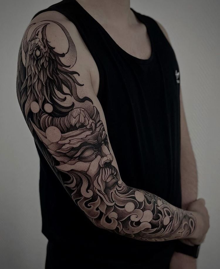
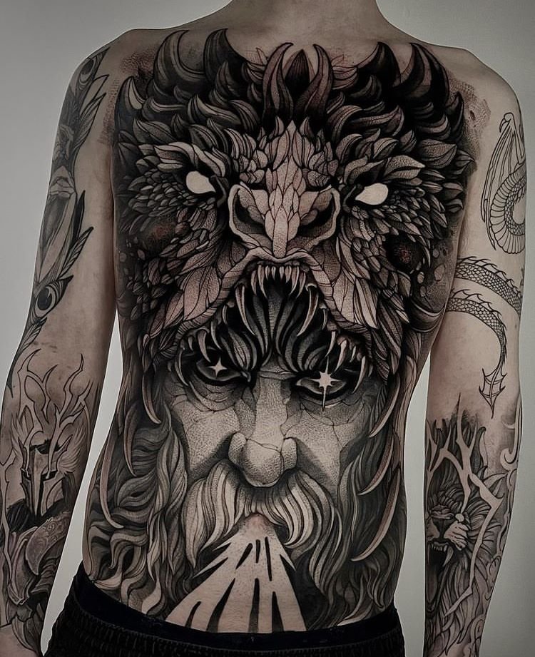
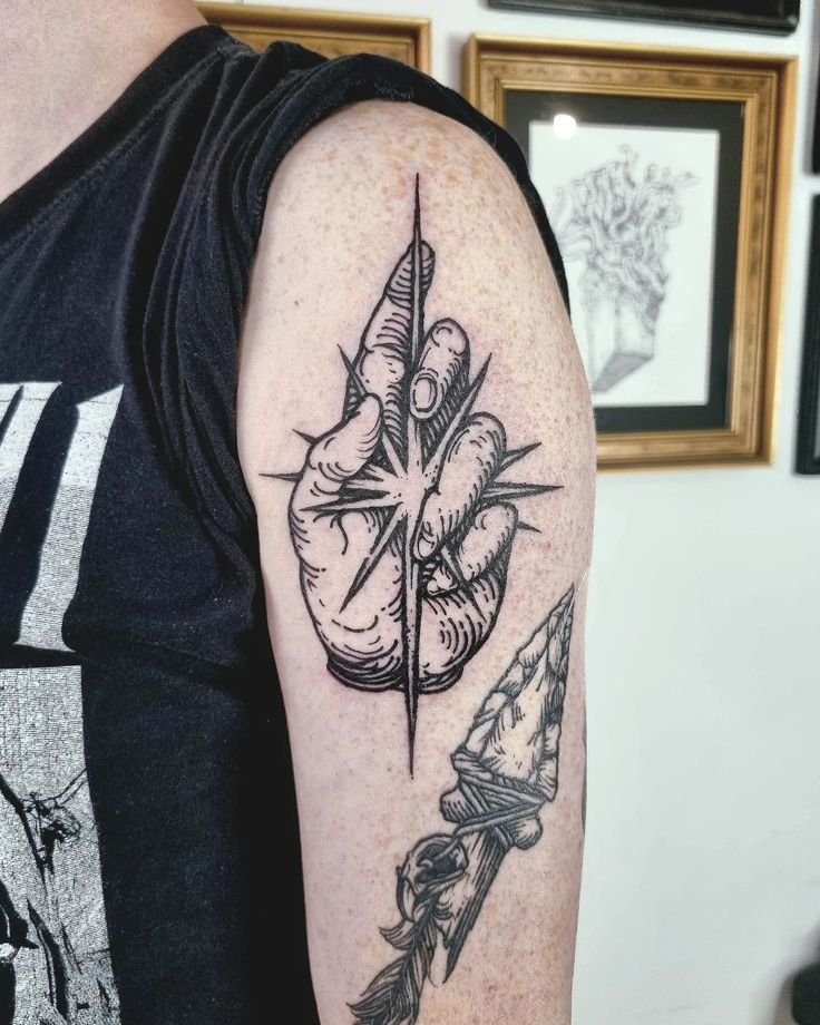
Woodcut and engraving style
Work that explicitly mimics the visual qualities of relief printing (woodcut, linocut) or intaglio printing (engraving, etching). The distinguishing features are the use of parallel lines and hatching to build tone — the same technique used to build tone in a print, where continuous tonal gradients are impossible and the artist must create the illusion of value through line density. This is one of the most technically specific branches of the style, and artists who work in it typically study historical printmaking closely.

Sketch style
Work that mimics the qualities of a rough pencil or pen sketch — visible construction lines, unfinished edges, loose hatching, the appearance of spontaneity. The aesthetic references the artist’s sketchbook rather than the finished illustration. Sketch-style tattoos often incorporate deliberate “imperfections” — lines that extend past their intersections, shading that trails off into loose marks, compositions that look as though they were drawn quickly. The appearance of looseness is carefully constructed; the technique is precise.

Watercolour illustrative
Line-based illustrative work with watercolour-style colour washes — translucent, blended, sometimes extending beyond the outlines to suggest the behaviour of pigment on wet paper. This branch combines the drawn line of the illustrative tradition with the coloured wash of watercolour painting. The watercolour elements are the most fragile component of the style in terms of ageing — the diffuse, uncontained colour areas tend to fade and soften faster than solid fills or defined shapes.
What separates illustrative from adjacent styles
Illustrative vs. fine line
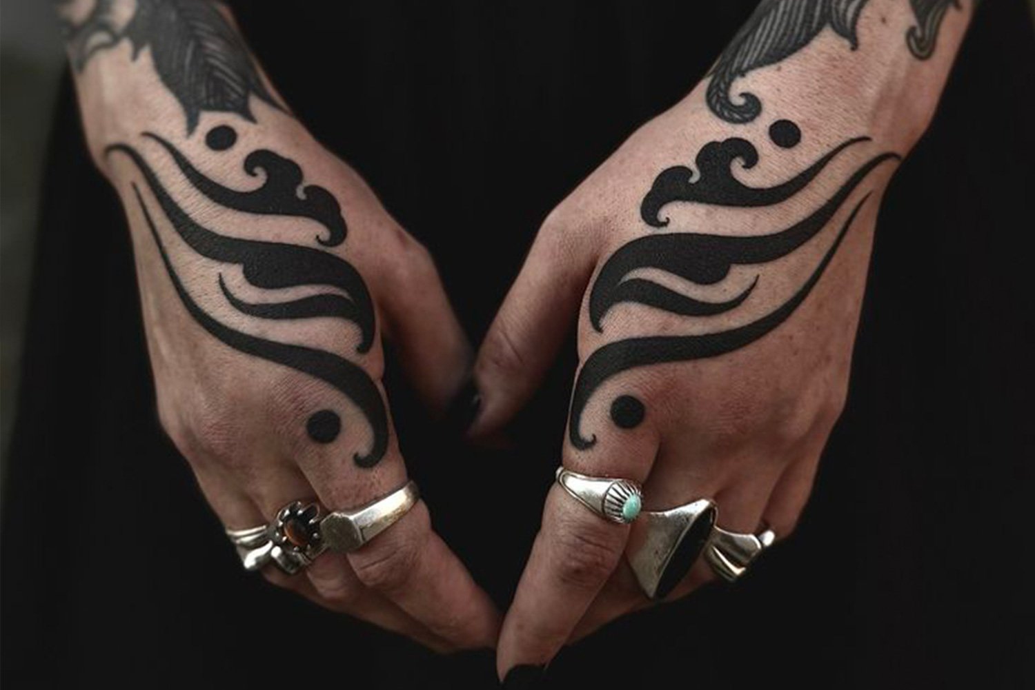
Illustrative vs. blackwork
Illustrative vs. neo-traditional
Illustrative vs. realism
Technical demands
Line quality
Hatching and cross-hatching
Composition
Reference management
Ageing anticipation
Ageing and longevity
Illustrative work ages along a spectrum determined by the density and weight of the marks.
Pieces with strong structural elements — solid black areas, heavy contour lines, dense hatching — age well. The solid areas hold their form, the heavy lines absorb some spreading without losing definition, and the dense hatching retains enough of its pattern to still read as texture even as individual lines soften.
Pieces built entirely from fine lines and light hatching — with no solid anchors and no heavy marks — soften more noticeably. The finest lines thicken into medium lines. Delicate cross-hatching blurs into a general grey tone. The image is still visible but has lost the crispness that defined it when fresh.
Watercolour elements age fastest. The diffuse, uncontained colour washes that characterise the watercolour branch of the style depend on soft, undefined edges and pale tonal values — exactly the elements that the skin’s natural ageing process attacks first. A watercolour wash that was translucent and delicate at one year may be barely visible at five.
The practical guidance is familiar from other style articles: scale determines detail survivability, placement affects the speed of ageing, and healed photographs are the only honest measure of an artist’s ability. For illustrative work specifically, the additional consideration is the ratio of heavy-to-light marks — a piece with a good balance of solid anchors and finer detail will age more gracefully than a piece built entirely from the lightest possible marks.
Choosing an illustrative artist
Look for a drawing practice. The best illustrative tattoo artists draw independently of their tattoo work — they keep sketchbooks, they make prints, they exhibit drawings. A portfolio that shows drawing skill outside of the tattoo context is a strong indicator that the artist can compose and execute an illustrative piece with real authority. A portfolio that shows only tattoo photographs, with no evidence of independent drawing, may indicate an artist who executes illustrative-looking work without the foundational skill to support it.
Identify the branch. An artist who works primarily in botanical illustration may not be the right choice for a literary narrative scene, and vice versa. The branches of the style draw on different source traditions and require different compositional skills. Identifying which branch matches your intention and finding an artist who works specifically in that branch yields better results than choosing an artist whose portfolio only occasionally touches on the illustrative style.
Check healed work. The advice that applies to every style, and that applies especially here, because the finest marks in illustrative work are the most vulnerable to ageing. Healed photographs at one year and beyond are the test. Fresh illustrative work always looks crisp. The question is whether the hatching still reads as hatching, whether the lines still hold their weight, and whether the composition still works after the settling process.
Discuss the source material. If your piece references a specific illustration tradition or a specific artist’s work, the conversation with your tattoo artist about that reference is part of the design process. A good illustrative tattooer will know the source traditions and have informed opinions on how to translate them into skin. That conversation — about what to keep, what to simplify, and what to adapt — is where the design succeeds or fails.
Illustrative tattoos now
Illustrative tattooing is in a strong position. The artist base includes a significant number of practitioners with strong drawing backgrounds, the style’s visual range continues to expand, and the work produced at the top of the field is technically and compositionally accomplished. The style appeals to clients who value the drawn quality of the work and want a tattoo that looks like a piece of art made by a human hand, with specific skill and reference.
The main risk the style faces is the same risk fine line faces: the social media economy rewards fresh photographs, and the finest illustrative work photographs beautifully when fresh. Whether the artist is designing for the photograph or for the decade is a question the client should ask, and the answer is usually visible in the healed work.
Sources & further reading
- Arthur Rackham, illustrations for A Midsummer Night’s Dream. Heinemann, 1908.
- Arthur Rackham, illustrations for Peter Pan in Kensington Gardens. Hodder & Stoughton, 1906.
- Edmund Dulac, illustrations for Stories from the Arabian Nights. Hodder & Stoughton, 1907.
- Kay Nielsen, illustrations for East of the Sun and West of the Moon. Hodder & Stoughton, 1914.
- Anna Felicity Friedman, The World Atlas of Tattoo. Yale University Press, 2015.
- Matt Lodder, Painted People: Humanity in 21 Tattoos. Harper, 2024.
- Nick Schonberger and Rob Kingston, Forever: The New Tattoo. Gestalten, 2012.
- Margo DeMello, Bodies of Inscription: A Cultural History of the Modern Tattoo Community. Duke University Press, 2000.
- Steve Gilbert, Tattoo History: A Source Book. Juno Books, 2000.